

Logistic Regression
(For the PPT of this lecture Click Here)


We have now come to the richest part of the Regression & Classification Section, which is Logistic Regression intuition. If you’re unfamiliar with the term and you read “logistic regression intuition” you might feel like you’re in for one tortuous tutorial.
You might be right to feel so since the tutorial involves some math and other complex material. By the end, you will realize that it’s actually not all that difficult, though, and you will find it to be pretty interesting. So, relax and let’s get to it.
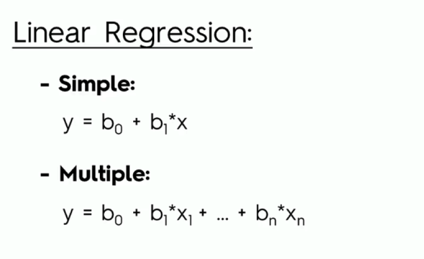
We already covered linear regression throughout the last three tutorials. We talked about both simple and multiple linear regression, and here is a quick reminder of their equations:
As you remember from the previous tutorials, the simple model includes one dependent variable and an independent variable that affects it.
Multiple linear regression, on the other hand, involves several variables that impact the dependent variable (y).
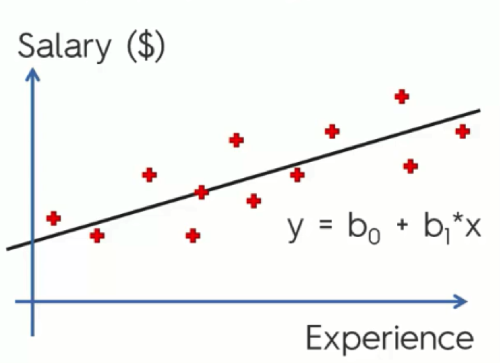
In this example from one of our previous tutorials, we saw how the simple regression model is used in drawing a trend line through our data.
We can then use this trend line to forecast the changes in salary as the level of experience increases, as well as compare the line to our actual observations.
Now, let’s get to the new stuff.
An Example on Logistic Regression
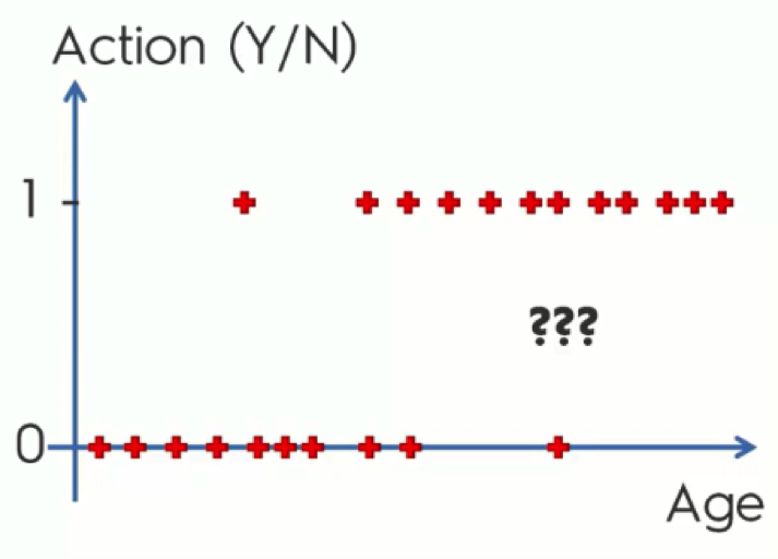
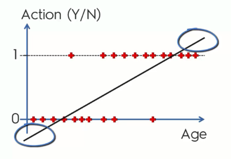
Say a company is sending out emails to customers or potential customers trying to persuade them to buy certain products and providing them with offers.
In the chart below, we have the contacted customers lined up horizontally. Those who are lined up along the x-axis are customers who declined the offers, whereas the other group consists of those who agreed to make a purchase.
Before we get into more details, stop reading for a moment and try to understand what this data actually means.
SPOILER: As you can see, the main pattern exhibited on the chart is that the older the customers are, the more likely they are to make the purchase. And, in contrast, the younger they are, the more likely they are to ignore the offer.
If that’s the conclusion you reached on your own before reading the spoiler, give yourself a little pat on the back before moving on.
Now, let’s get to the actual regression part.
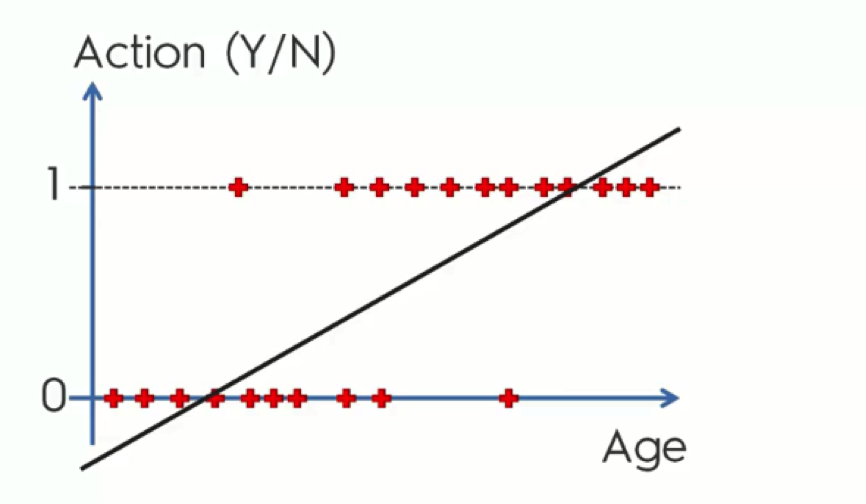
Looking at this regression line, you probably got the feeling that there is something off about it. It doesn’t seem to be the best fit for our data – or at least it’s not obvious why it might be.
Let’s slowly walk through it together.
Probability
Instead of trying to predict each customer’s action, we’ll calculate the probabilities. The graph shows the Y-axis numbered from 0 to 1 and it so happens that probability falls between 0 and 1. What a match!
The reason that our current data only stands at either 0 or 1 is that we already have the actual results from our observation. When we’re predicting, though, our points would fall between 0 and 1, because in this case we’re only working with probabilities and do not have any solid observations.
Now, let’s say that the point where the line intersects with the x-axis stands for 35 years old customers. What this line does, in this case, is tell us that anyone who is 35 or more has a probability to buy one of the company’s products, and the older they get the more probable they are to do it.
This way, we can learn that a 40-year old customer has a probability of 0.3 to make a purchase, for example, whereas a 55-year old would have a 0.7 probability.
That makes sense, doesn’t it?
Well, there’s still a small part of the chart that doesn’t. These are the parts of the line which extend below 0 and above 1. We know that probability can only fall between 0 and 1, and so, if this line is there to mark the probabilities of customers buying the company’s products, it should only fall within those boundaries.
Even if mathematically this is the case, the way these extra parts are used is as an assurance.
Ever heard someone say “I’m more than 100% sure about this?” No one who says that believes that there is more than 100% (hopefully!), but it’s used as a solid confirmation.
What we mean by this is that, in our example, those who are below 35 are most definitely not going to purchase any products, whereas those who are, say, above 70, are “more than 100%” likely to do so.
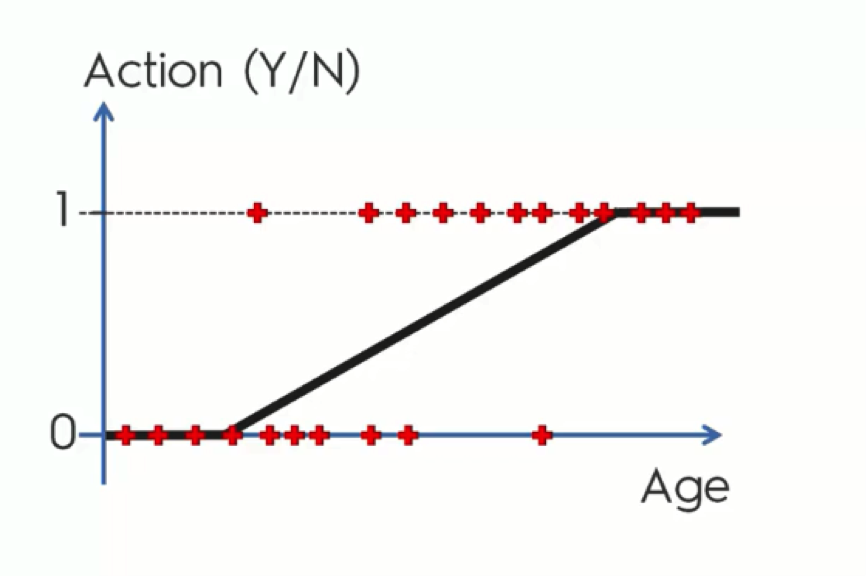
What we usually do with these extras, though, is twist them to fit into the graph’s boundaries as you see in the below figure.
The Logistic Regression Equation
Up until now, we’ve developed a very basic understanding of how logistic regression intuition works. We can now get to the scientific approach.
Try not to get any panic attacks from the coming figure. We’ll break it down very easily.
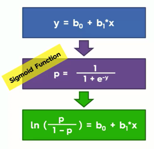
There are three components to our next operation:
- Simple Regression Equation
- Sigmoid Function
- Logistic Regression Function
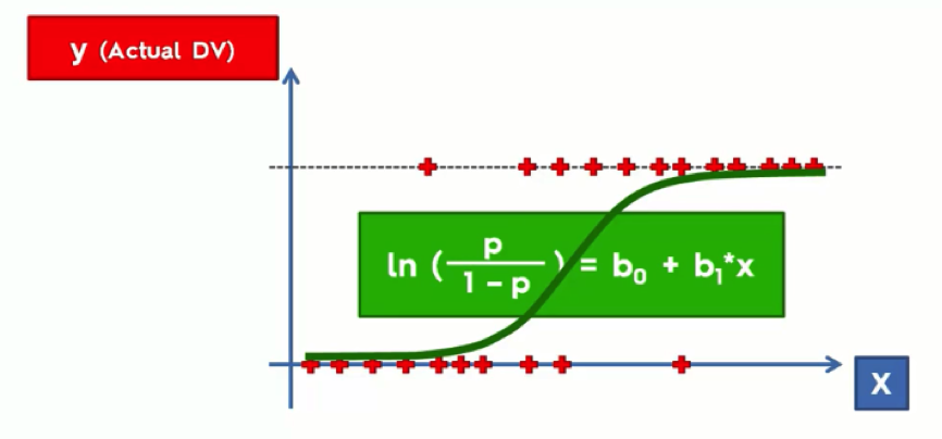
At the top, we have the simple linear regression equation that we already know from the previous tutorials.
If we were to take the “y” in this equation and apply it to the Sigmoid Function in the purple box, and then take that outcome and return it to the simple linear regression equation in the blue box, we would end up with the green box. That green box is the logistic regression equation.
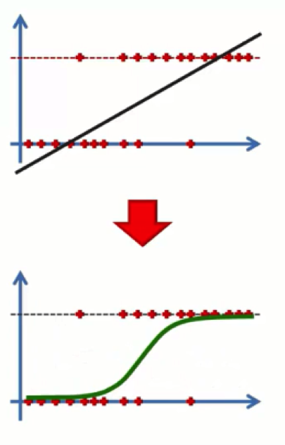
What this will do is convert our chart from how it looks at the top end of the below figure to that other form. Basically, the line that extends beyond 0 and 1 is a line derived through the simple regression method. If you apply to it the logistic regression equation, it manages to fix itself.
At this point, you probably have one of two expressions on your face.
You either feel like a bigger-than-life genius…
Or you’re just like most of us average folks when first hearing about logistic regression…
If you’re the former, you’ll find the rest of this section too easy for your big brains. If you’re relating better to Joey, just bear with us. We’ve all been there.
Let’s make a further breakdown of the process.
As you see from the graph above, we have the dependent variable on the Y-axis. This is the (yes/no) variable. On the X-axis, we have the independent variable. The data is lined up on 0 and 1 and we have the regression curve drawn between or through that data. This line simply plays the same role of the straight trend line in a simple linear regression model.
In both cases we’re searching for the “best fitting” line.
Once we’ve got our curve, we can forget about this daunting equation with its ugly little green box.
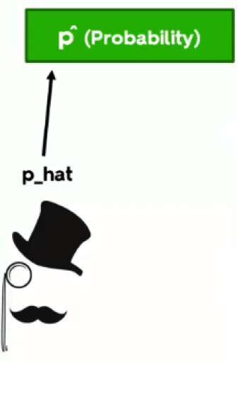
By the way, around here we call probability “p-hat.” Whenever a hat is mentioned, it means we’re predicting something. Just think of that elegant fellow in the figure below.
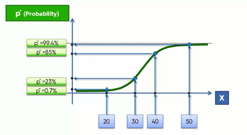
Let’s now take another look at the graph.
At the bottom, we lined up the age groups along the X-axis. We then project these onto our regression curve; these are the fitted values for each of the age groups, and to derive the probabilities from these, we then need to project them onto the Y-axis where we’ll get a value between 0 and 1.
Prediction
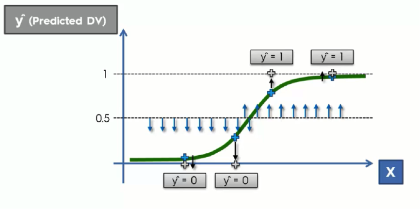
Let’s say that instead of a probability, we want an actual prediction. The difference here is that, unlike the probability, the prediction will be valued at either 0 or 1. Like the probability, however, it is not based on any actual observations.
What we do in this case is to draw an arbitrary straight line across the graph. This line is drawn based on your knowledge of each particular case at hand. Usually, it is drawn at exactly 50% for the sake of symmetry.
What we do next is project any point that is below the 50% line downward to 0, while anything above it would be projected upward to 1.
What this basically says is: If the customer’s probability is below 0.5, then we can predict that they won’t buy anything. If their probability is above 0.5, we can predict a purchase.
Logistic Regression In a Nutshell…
To wrap this up, you now understand the similarities and the differences between the simple regression and the logistic regression methods.
They both aim at finding the best fitting line – or curve in the logistic regression case – for the data we have.
With logistic regression, we are aiming at finding probabilities or predictions for certain actions rather than changes as in the simple regression case.
We hope that this tutorial has been simple enough to leave you with the same handsome smugness that is on Neil deGrasse Tyson’s face in the image above.
If it did, you’re now ready to move on to the next tutorial.