

No doubt, the Python Package Index is teeming with libraries suited for practically every data visualization need out there. Whether you need a library that is intensely focused on accomplishing a specific task, or one that can be used for various purposes, Python has got you covered, hands down. n
n
And yet, considering the sheer amount of competing libraries that coders get to choose from these days, it comes as no surprise that many ends up feeling lost at sea.n
n
This predicament raises a couple of questions: how do we know which library will serve us best? And considering the nature of each project, what method of visualization makes it possible to adequately structure and portray large data arrays – and thus make information more comprehensible to the audience?n
Picking the right frameworkn
Indeed, navigating through the seemingly endless options for bar-plotting, line-plotting, scatter-plotting, and even pie-charting can often seem like a Sisyphean task.n
n
Fear not, though.n
n
In order to save you time and endless hours of research, we created this guide to help you get to grips with some of the most popular visualization libraries. As overwhelming as it may seem to pick a framework that fits your project needs accordingly, always keep in mind that the primary job of good data visualization is to give users solid information in a comprehensible, almost visceral way – not to sacrifice one for another.n
n
So to help you find your footing, we’re going to make a quick breakdown of some of the most famous visualization libraries and their application based on the project you need to fulfill (with our own little commentaries):n
- Data science neural network. The vast majority of tutorials for data science use matplotlib. This general-purpose visualization library is suitable for multiple projects as it serves as a base for applying other frameworks over it.n
- Data regression or classification model. It is highly likely that a coder doing regression or classification will gravitate toward Seaborn because of its correlation matrix. As the name suggests, what this matrix shows – at just one glance – is whether data elements have a mutual relationship or connection.n
- Stock ticker. This kind of project typically requires a chart that can plot real-time data and respond when the user moves the cursor over the chart. Our recommended choices here are Plotly or Bokeh, two frameworks that support JavaScript.n
- Mapping. For instance, if a coder is assigned to work with a MongoDB database, which stores geographic and other data in JSON format, the task would most likely require drawing maps. In that case, our framework suggestion would be geoplotlib simply because it is designed especially for that purpose.n
- Applied statistics in a university or research setting. Coders doing research – which may include clinical trials for drug companies or utilizing algorithms to make the judicial process a lot less biased – are most likely going to use the R programming language. However, nowadays this trend is shifting towards the use of Python simply because this language has become widespread in terms of machine learning tasks. But considering that it’s easier for R programmers to use something they already know, the recommended solution would be ggplot since it can work as a Python front-end for the ggplot R-language visualization library.n
Of course, this is just the tip of the iceberg when it comes to data visualization libraries – it’s a field that’s constantly evolving and becoming more nuanced with each passing day. The fact is, we’ve moved far past the point where the ‘one-size-fits-all’ approach can be applied to every single project. Nowadays, if coders aren’t willing to go beyond one library, it would certainly be a debilitating oversight. n
Matplotlibn
n
Saying that matplotlib is the O.G. of Python data visualization libraries wouldn’t be an overstatement. Despite being over a decade old (the first version was developed in the 1980s), this proprietary programming language is regarded as one of the most sought-after libraries for plotting in the coder community. It was designed to closely resemble MATLAB, enabling programmers to stack charts either by putting multiple metrics onto a single chart or multiple charts on a single page.n
n
Because matplotlib was the initial Python data visualization library, many other libraries are built on top of it or are designed to work in tandem with other libraries. That means you can pass it any kind of Python array-type data – like pandas DataFrames or Numpy arrays – without having to convert those to another format.n
n
While matplotlib does the job beautifully when it comes to getting a sense of the data, it’s not particularly useful for creating publication-quality charts. Or as Chris Moffitt puts it in his overview of Python visualization tools, matplotlib “is extremely powerful but with that power comes complexity.” n
Here are some sample charts created with matplotlib:n
Line Chartn
This code plots a Numpy array from 1 to 5 in increments of 0.25.n
n
import matplotlib.pyplot as plt import numpy as np y = np.arange(1,5,0.25) plt.plot(y, 'go') 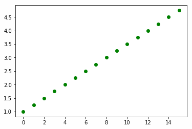
Graphic Source I Created This from Matplotlibn
Here are some more examples taken from the matplotlib documentation:n
Stacked Bar Chartn
n
n
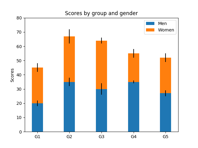
Stacking one metric on top of the other lets a single chart show more data. For instance, here we see scores broken down by group then sex.n
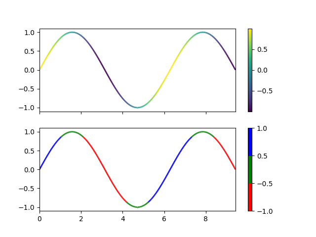
Colored Line Chartn
n
This is an example of two charts placed on a single canvas. Color is used to make it easier to see data points that are in a certain range.n
n
n
n
Seabornn
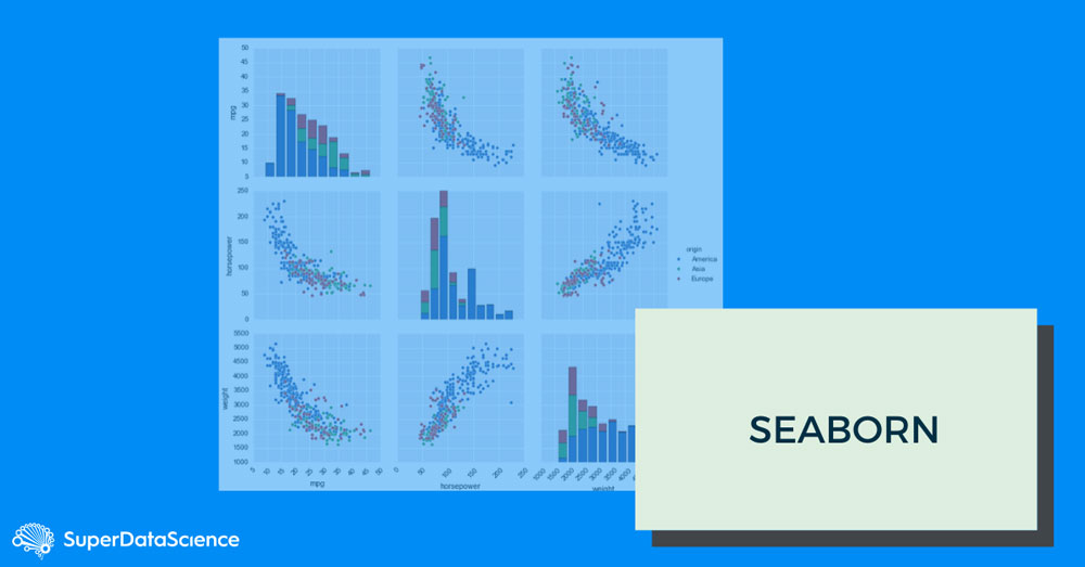
n
By harnessing the power of matplotlib, Seaborn is able to create vivid, stylized charts in just a few lines of code. Indeed, one of the perks of using this library is the ample choice of default styles and color palettes, enabling coders to create aesthetically pleasing and, most importantly, comprehensive chart designs. n
n
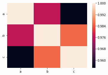
Data scientists often use Seaborn’s Correlation Matrix as a first step in inspecting data. We mentioned before that this matrix does a bang-up job in finding correlations between inspected elements. If data is not correlated in any way, the data scientist can easily abandon his or her assumption and take another approach, drastically saving time (and nerves). Bear in mind, though, that Seaborn does integrate well with pandas.n
In the chart below, notice the correlation between each pair of points found in the three variables a, b, and c.n
Now, take a look at the chart and the legend to the right. We can see that the pairs in the middle are 100% (tan color) because every value is perfectly correlated with itself. But if we look at (b,c), we can see that the correlation between b and c is 98%.n
Below is the code we used to generate the chart. As you can see, the charting-related code is short, illustrating that Seaborn indeed does all the complicated work.n
n
n
import numpy as np import seaborn as sns import matplotlib as plt import pandas as pd x = np.arange(10) y = np.arange(10) z= np.multiply(x,y) a=np.array([x,y,z]) b=a.reshape(10,3) data = pd.DataFrame(b, columns=['a', 'b', 'c']) corr = data.corr() sns.heatmap(corr, n xticklabels=corr.columns.values,n yticklabels=corr.columns.values)n
n
n
Bokehn
n
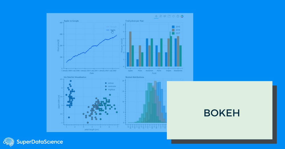
What distinguishes Bokeh from all the other libraries is that it allows dynamic visualization, which is supported by modern browsers. Because it renders graphics using JS and HTML, it can be used for web applications with a very high level of interactivity.n
n
Bokeh is available in R and Scala language as well; however, its Python counterpart is more commonly used than others. Another thing worth mentioning is that Bokeh is different from most libraries in that it does not depend on matplotlib. n
n
The major concept of this data visualization library is that graphs are built up one layer at a time. We start out by creating a figure, and then we add elements – a.k.a glyphs – depending on the desired use: lines, circles, bars, arcs, patches, etc. (For those who have used ggplot, the idea of glyphs is essentially the same as that of geoms, which are also added to a graph one layer at a time.)n
Also note that Python cannot do any of that in a browser. If you want to create charts with Python, you need an environment that has both a Python interpreter and supports graphics (something which Zeppelin or Jupyter notebooks can help with). n
Here is a sample Bokeh chart:
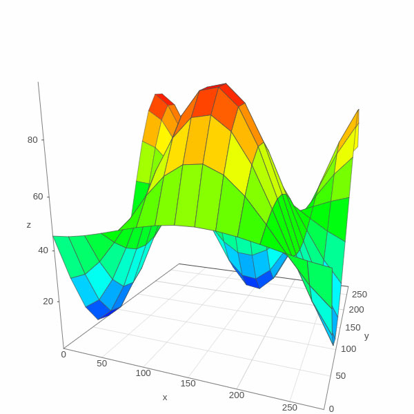
a 3D image of a plane taken from their website. If you click the link you will see that the image is actually moving, that, courtesy of JavaScript.n
n
n
n
n
n
n
n
n
Geoplotlibn
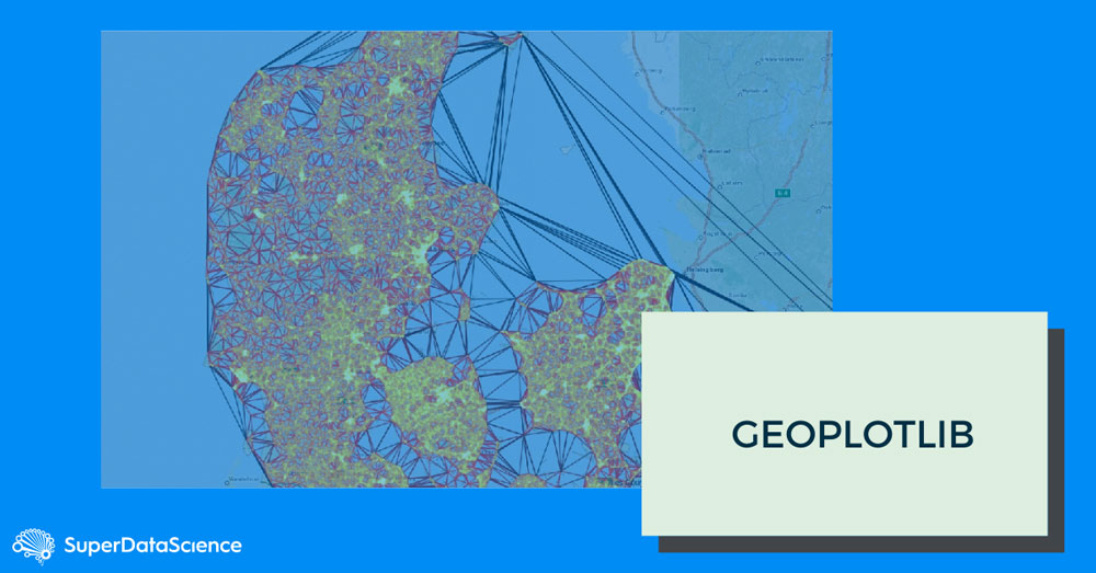
n
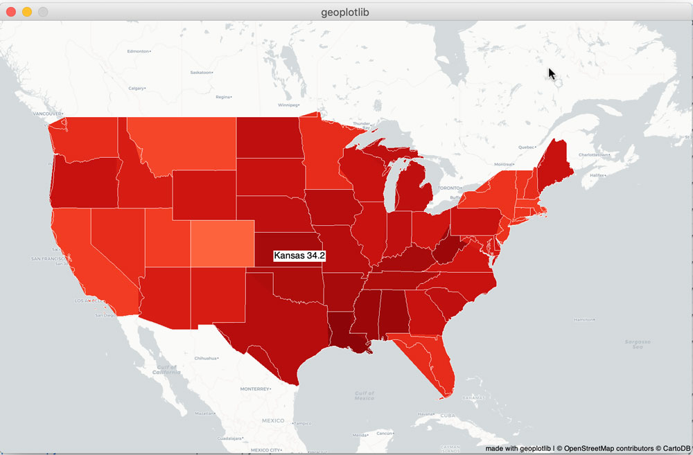
Geoplotlib is an open-source Python toolbox that serves to visualize geographical data. It’s library supports the development of hardware-accelerated interactive visualizations and provides implementations of dot maps, kernel density estimation, spatial graphs, Voronoi tessellation, shapefiles and many other spatial visualizations.n
Mapping is a specialized field – one which requires you to understand the concepts, such as Convex hull, Delaunay triangulation, projection, and GeoJSON.n
GeoJSON format was developed by the US Geological Survey, which locates items with longitude, latitude, polygons, etc.n
Here is some sample data, from GeoJSON.org.n
n
{n "type": "Feature",n "geometry": {n "type": "Point",n "coordinates": [125.6, 10.1]n },n "properties": {n "name": "Dinagat Islands" } } Geoplotlib graphs include features common to working with maps. This includes keyboard combinations like panning and adding or removing layers.n
Here is an example is taken from the Geoplotlib GitHub code repository.n
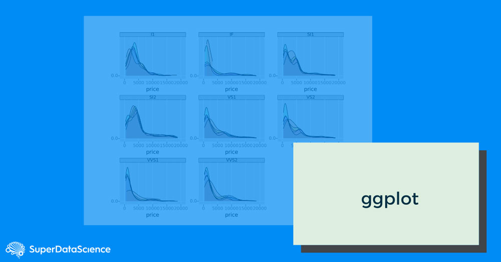
Ggplot
n
Based on the Grammar of Graphics, ggplot is a system for understanding graphics which are composed of various layers that together create a complete plot. Its powerful model of graphics makes the entire process of building complex multi-layered graphics much simpler. n
n
Similar to Seaborn, this library can also be built on top of matplotlib, improving the visual appeal of matplotlib’s visualizations in a simple yet sophisticated way. It diverges from seaborn in that it is a port of ggplot2 for R. n
n
Now, R is the language most data scientists in academia and research used before TensorFlow. So ggplot is designed to let R programmers use what they are comfortable with. Even though some of the API is non-pythonic, given the goal, it can serve as a very powerful data visualization library, nonetheless.n
n
Plotlyn
n
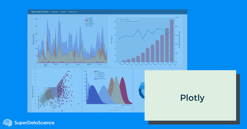
What makes Plotly unique is the ability to respond to mouseover, cursor click, and data-update events. But considering that Python does not run in a browser, creating both graphics and Javascript is necessary. n
You’ll need to follow the docs to get your API key set up. Once you do, it all seems to work pretty seamlessly. The only caveat is that everything you are doing will be posted on the web so make sure you have no issues with that prospect. n
Another thing worth mentioning is that Plotly and Bokeh are competitors. The primary criticism with Plotly is that you have to convert data to dictionaries. That explains Express, a front-end for Plotly designed to make it easier to work with Panda DataFrames.n
Sample Chartn
n
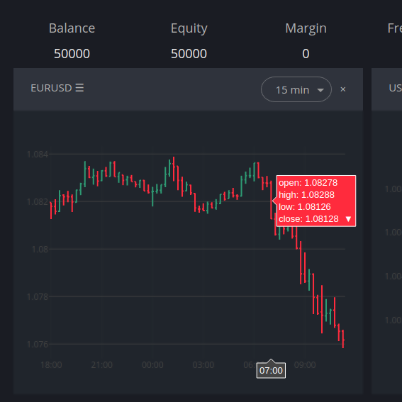
Here is a perfect use case that shows why you need JavaScript. You will find a finance chart whose data points are too close together to show all the relevant information. So you will most likely need a popup to show more information at each data point. When you move the cursor across the chart, an annotation box pops up to show those insightful details.n
To wrap it up…n
To be candid, plotting data and creating visualizations in the vast Python ecosystem is a classic good news/bad news scenario. The good news is: there is an abundance of options. The bad news is: there is an abundance of options.n
Trying to figure out which library will work the best depends entirely on what it is that you’re trying to accomplish. In most cases, you just need to allocate some testing time and see whether the tool features will match project requirements. Remember, there are no definite winners or losers here, just various visualization possibilities that may not fit in some cases but could work magic in others. n
n
Here are some of the key takeaways:n
n
- Matplotlib is like the mother of all Python libraries. It serves as an excellent base, enabling coders to “wrap” other tools over it. n
- Seaborn may be able to support some more complex visualization approaches but it still requires matplotlib knowledge to fine-tune things. n
- Bokeh is a robust tool for setting up your own visualization server but maybe a bit overkill when creating simple scenarios.n
- Geoplotlib will get the job done if you need to visualize geographic data. n
- Ggplot shows a lot of promise but still has a lot of growing up to do.n
- Plotly generates the most interactive graphs, which can be saved offline to create vivid web-based visualizations.
n
If we’ve missed anything or there are other data visualization libraries out there that are worth a mention, let us know and we will gladly expand our review with your suggestions.