


The last step in our Deep Learning journey is here… Regression & Classification and you’re done. It’s not time to shy away now, Deep Learning mastery is one Ultimate Guide away! Let’s go!
Regression & Classification – Plan of Attack
Are you excited about the idea to uncover the essence of Regression & Classification?
Hope you are… because we are now venturing into a complex, very forward-looking and cutting-age areas of deep learning!
But what’s really important to keep in mind – this going to be very, very fun!
So, how are we going to approach this section in Deep Learning?
First of all, we will learn the basics of Regression & Classification – Simple Linear Regression: Step 1. You’ll be sure to remember this section from before, it’s back to basics time in this tutorial.
Step 1 isn’t going to be enough with Simple Linear Regression. Hop on to Step 2 to continue these lessons.
Then, we’ll talk about Multiple Linear Regression, a tiny, but necessary section of Regression & Classification.
Then, we’ll have a look at some great practical examples to get an idea on what’s actually going on in the brain of LSTM. Ready to get started? Then move on to our next section!
Simple Linear Regression: Step 1
Welcome to Part 1 of Regression & Classification – Simple Linear Regression: Step 1.
You probably remember the concept of simple linear regression intuition from your high school years. It’s the equation that produces a trend line that is sloped across the X-Y axes.
Here’s the simple linear regression equation to refresh your memory:
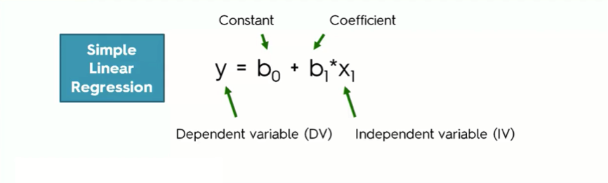
Here’s a breakdown of the simple linear regression equation:
- The dependent variable (DV): As you probably already guessed from the name, the DV is a variable that you try to understand in terms of its dependence on another variable. For example, how is your body fat level affected by the number of hours you spend jogging every week? How does your GPA change in relation to your studying hours?
The body fat level and the GPA here are our dependent variables.
- The independent variable (IV): The IV is the variable that affects the dependent variable. In the two examples that we just mentioned, the jogging hours and the studying hours are the independent variables in their respective cases.
Sometimes, the IV does not have that same sort of direct impact on the DV, though.
- The coefficient: In the simple linear regression equation, the independent variable’s coefficient basically determines how a one-unit change in the IV can affect the DV.
It’s simply the middleman between the DV and the IV. The reason we need this middleman is that the rate of change in the IV can often not be in proportion to the change in the DV.
- The constant (b0): That’s the point where the straight line intersects with the Y-axis.
Let’s take an example so that you can see how all of this actually works.
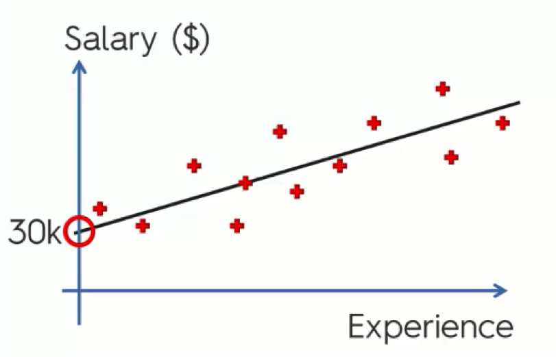
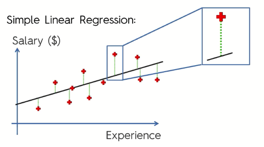
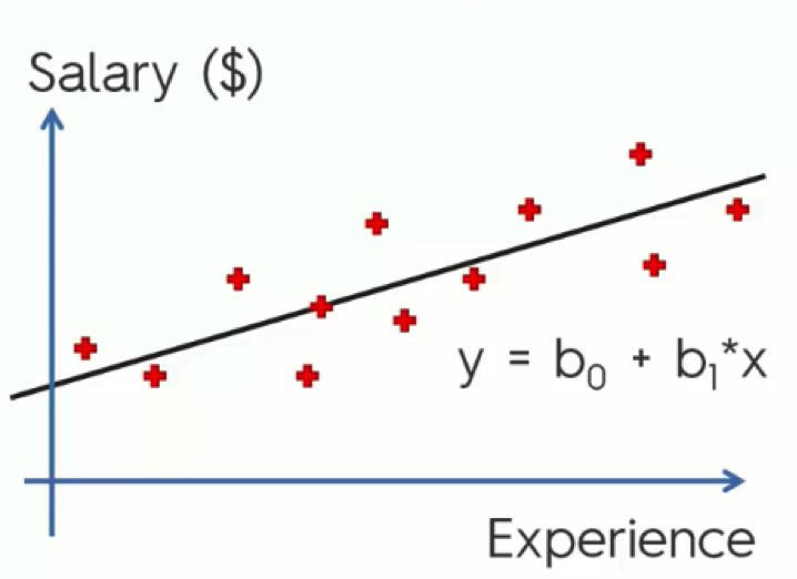
Example: Salary & Experience
In the example below, the salary is the dependent variable (y), while experience is the independent variable (x1). In that case, the equation would go like this:
Salary = b0 + b1 * Experience
Using the results, you then go on to draw a straight line that best fits these results.
As we move on to the next tutorial and talk about ordinary squares, you’ll get to understand what exactly is meant by “best fits” in this context.
As you can see, the constant here is 30k. What this means is that when you start off without any experience, the salary starts at $30,000. This is the basic point from which the changes take place.
What number do we use for the coefficient, then?
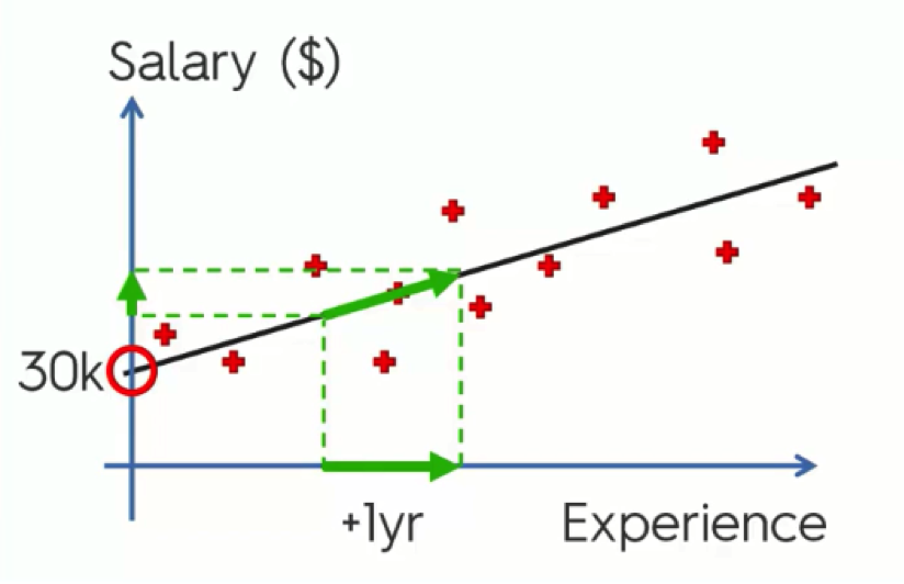
Since we’re dealing with a sloped line, b1 is the slope of our line. That way the steeper the line the bigger the change that happens to the dependent variable (y) with every unit change in the independent variable (x1).
In this example, b1 is the rate of increase in the salary with every additional year of experience.
If we mark the change on the x-axis (Experience), link it to the straight line, and project that on the y-axis (Salary), we would be able to derive the change in salary.
So, that’s the basic utility of the simple linear regression method.
Part 1 of the Regression & Classification section – check!
In the next tutorial, we’ll get into more details as to how we can implement it.
Simple Linear Regression: Step 2
You survived part 1!
Welcome to Part 2 of Regression & Classification – Simple Linear Regression: Step 2.
As we said in the last tutorial on simple linear regression intuition, the simple regression line in a nutshell is a trend line that best fits your data. We said that in this tutorial we will be discussing what that really means.
It’s quite a brief tutorial.
Are you ready?
The “Best Fitting” Line
So, how does the simple linear regression equation help you find that “best fitting” line we’re talking about?
Let’s take another look at the salary-experience example from the last tutorial.
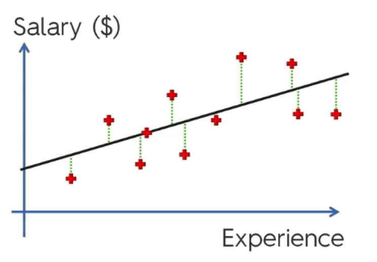
As you can see, we have the observation data plotted all over the graph, as well as the simple regression line running through its points.
Now, let’s pick a random point and examine it more closely.
Here we have the salary of someone with x years of experience. The straight line represents where that person’s salary should be according to our simple linear regression model, whereas the red point is what that person is actually earning.
Typically, these two corresponding points are named as shown in this figure below.
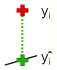
The difference between the two is the gap between our observation and our model.
What you do with these points is measure the green line connecting them together. That is the value of the gap. You do the same with each two corresponding points on the graph, square them, and then, finally, sum them up.
After calculating the sum, you then find the minimum value.

The Wrap-Up
So, what the simple linear regression process does is help us draw all of the possible lines using a set of data, and then by calculating the sum of their squares with every single line and recording it, it is able to detect the minimum sum of squares.
The line with the minimum sum of squares possible is the best fitting line.
Congrats on finishing Part 2 of the Regression & Classification section.
Onward!
Multiple Linear Regression
A tiny lecture of our Regression & Classification section – Multiple Linear Regression.
Multiple Linear Regression intuition is the same as Simple Linear Regression but with multiple variables and combinations of b (coefficients) and x (independent variables).
Here’s the difference between both equations.
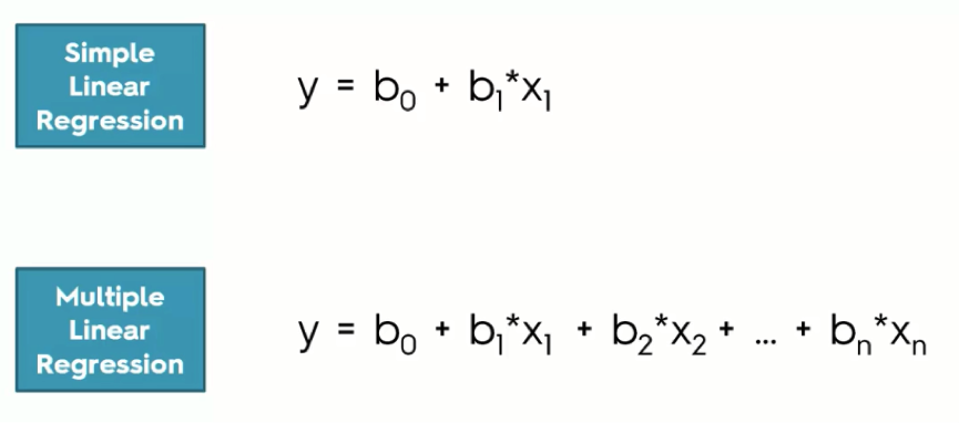
We use the multiple linear regression model when we’re dealing with a dependent variable that is affected by more than one factor.
For example, a person’s salary can be affected by their years of experience, years of education, daily working hours, etc. In this case we would use multiple linear regression.
Logistic Regression
We have now come to the richest part of Regression & Classification, welcome to Logistic Regression intuition.
If you’re unfamiliar with the term and you read “logistic regression intuition” you might feel like you’re in for one tortuous tutorial. You might be right to feel so since the tutorial involves some math and other complex material.
By the end, you will realize that it’s actually not all that difficult, though, and you will find it to be pretty interesting. So, relax and let’s get to it.
We already covered linear regression throughout the last three tutorials.
We talked about both simple and multiple linear regression, and here is a quick reminder of their equations:
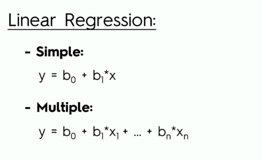
As you remember from the previous tutorials, the simple model includes one dependent variable and an independent variable that affects it.
Multiple linear regression, on the other hand, involves several variables that impact the dependent variable (y).
In this example from one of our previous tutorials, we saw how the simple regression model is used in drawing a trend line through our data.
We can then use this trend line to forecast the changes in salary as the level of experience increases, as well as compare the line to our actual observations.
Now, let’s get to the new stuff.
An Example on Logistic Regression
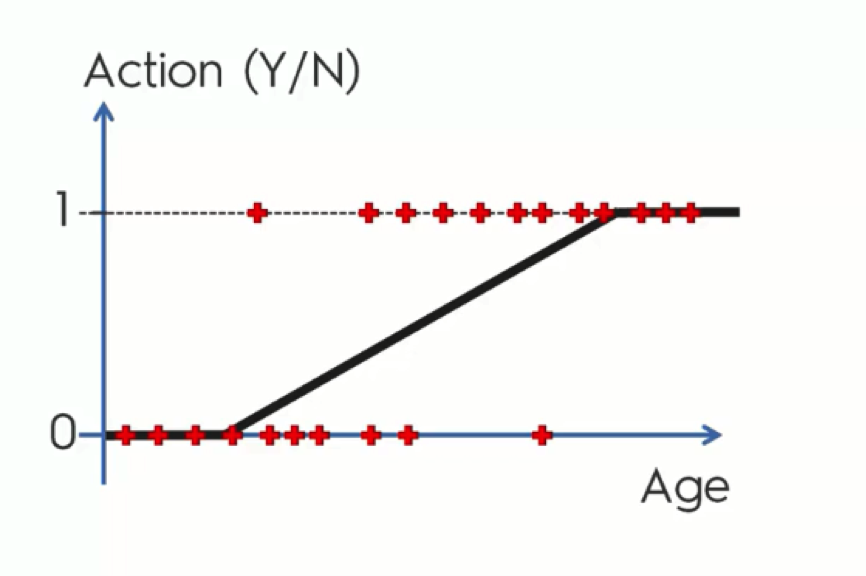
Say a company is sending out emails to customers or potential customers trying to persuade them to buy certain products and providing them with offers.
In the chart below, we have the contacted customers lined up horizontally. Those who are lined up along the x-axis are customers who declined the offers, whereas the other group consists of those who agreed to make a purchase.
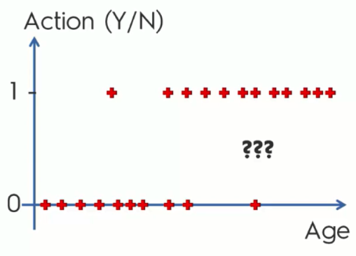
Before we get into more details, stop reading for a moment and try to understand what this data actually means.
SPOILER: As you can see, the main pattern exhibited on the chart is that the older the customers are, the more likely they are to make the purchase. And, in contrast, the younger they are, the more likely they are to ignore the offer.
If that’s the conclusion you reached on your own before reading the spoiler, give yourself a little pat on the back before moving on.
Now, let’s get to the actual regression part.
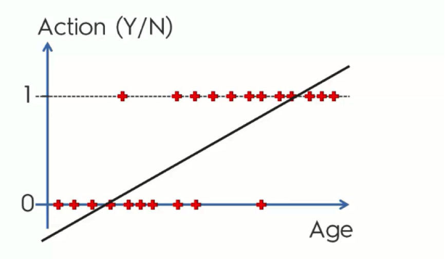
Looking at this regression line, you probably got the feeling that there is something off about it. It doesn’t seem to be the best fit for our data – or at least it’s not obvious why it might be.
Let’s slowly walk through it together.
Probability
Instead of trying to predict each customer’s action, we’ll calculate the probabilities. The graph shows the Y-axis numbered from 0 to 1 and it so happens that probability falls between 0 and 1. What a match!
The reason that our current data only stands at either 0 or 1 is that we already have the actual results from our observation. When we’re predicting, though, our points would fall between 0 and 1, because in this case we’re only working with probabilities and do not have any solid observations.
Now, let’s say that the point where the line intersects with the x-axis stands for 35 years old customers. What this line does, in this case, is tell us that anyone who is 35 or more has a probability to buy one of the company’s products, and the older they get the more probable they are to do it.
This way, we can learn that a 40-year old customer has a probability of 0.3 to make a purchase, for example, whereas a 55-year old would have a 0.7 probability.
That makes sense, doesn’t it?
Well, there’s still a small part of the chart that doesn’t. These are the parts of the line which extend below 0 and above 1. We know that probability can only fall between 0 and 1, and so, if this line is there to mark the probabilities of customers buying the company’s products, it should only fall within those boundaries.
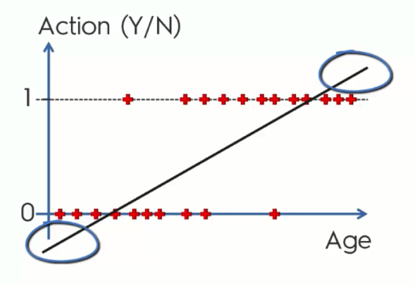
Even if mathematically this is the case, the way these extra parts are used is as an assurance.
Ever heard someone say “I’m more than 100% sure about this?” No one who says that believes that there is more than 100% (hopefully!), but it’s used as a solid confirmation.
What we mean by this is that, in our example, those who are below 35 are most definitely not going to purchase any products, whereas those who are, say, above 70, are “more than 100%” likely to do so.
What we usually do with these extras, though, is twist them to fit into the graph’s boundaries as you see in the below figure.
The Logistic Regression Equation
Up until now, we’ve developed a very basic understanding of how logistic regression intuition works. We can now get to the scientific approach.
Try not to get any panic attacks from the coming figure. We’ll break it down very easily.
There are three components to our next operation:
- Simple Regression Equation
- Sigmoid Function
- Logistic Regression Function
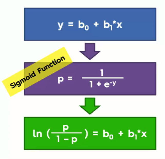
At the top, we have the simple linear regression equation that we already know from the previous tutorials.
If we were to take the “y” in this equation and apply it to the Sigmoid Function in the purple box, and then take that outcome and return it to the simple linear regression equation in the blue box, we would end up with the green box. That green box is the logistic regression equation.
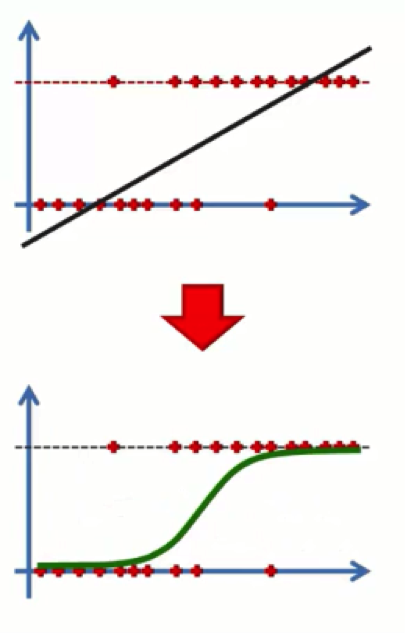
What this will do is convert our chart from how it looks at the top end of the below figure to that other form. Basically, the line that extends beyond 0 and 1 is a line derived through the simple regression method. If you apply to it the logistic regression equation, it manages to fix itself.
At this point, you probably have one of two expressions on your face.
You either feel like a bigger-than-life genius…

Or you’re just like most of us average folks when first hearing about logistic regression…

If you’re the former, you’ll find the rest of this section too easy for your big brains. If you’re relating better to Joey, just bear with us. We’ve all been there.
Let’s make a further breakdown of the process.
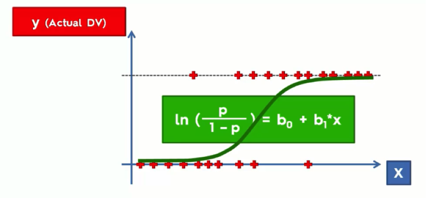
As you see from the graph above, we have the dependent variable on the Y-axis. This is the (yes/no) variable. On the X-axis, we have the independent variable. The data is lined up on 0 and 1 and we have the regression curve drawn between or through that data. This line simply plays the same role of the straight trend line in a simple linear regression model.
In both cases we’re searching for the “best fitting” line.
Once we’ve got our curve, we can forget about this daunting equation with its ugly little green box.
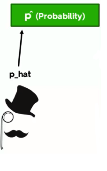
By the way, around here we call probability “p-hat.” Whenever a hat is mentioned, it means we’re predicting something. Just think of that elegant fellow in the figure below.
Let’s now take another look at the graph.
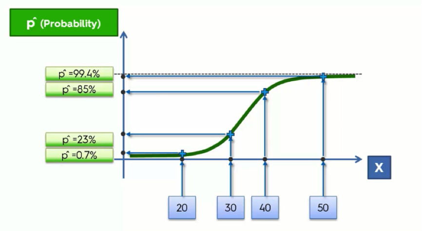
At the bottom, we lined up the age groups along the X-axis. We then project these onto our regression curve; these are the fitted values for each of the age groups, and to derive the probabilities from these, we then need to project them onto the Y-axis where we’ll get a value between 0 and 1.
Prediction
Let’s say that instead of a probability, we want an actual prediction. The difference here is that, unlike the probability, the prediction will be valued at either 0 or 1. Like the probability, however, it is not based on any actual observations.
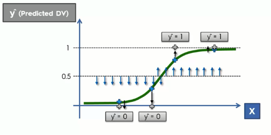
What we do in this case is to draw an arbitrary straight line across the graph. This line is drawn based on your knowledge of each particular case at hand. Usually, it is drawn at exactly 50% for the sake of symmetry.
What we do next is project any point that is below the 50% line downward to 0, while anything above it would be projected upward to 1.
What this basically says is: If the customer’s probability is below 0.5, then we can predict that they won’t buy anything. If their probability is above 0.5, we can predict a purchase.
Logistic Regression In a Nutshell…
To wrap this up, you now understand the similarities and the differences between the simple regression and the logistic regression methods.
They both aim at finding the best fitting line – or curve in the logistic regression case – for the data we have.
With logistic regression, we are aiming at finding probabilities or predictions for certain actions rather than changes as in the simple regression case.
We hope that this tutorial has been simple enough to leave you with the same handsome smugness that is on Neil deGrasse Tyson’s face in the image above.
If it did, you’re now ready to move on to the next tutorial.