

Reading an Advanced SOM
(For the PPT of this lecture Click Here)
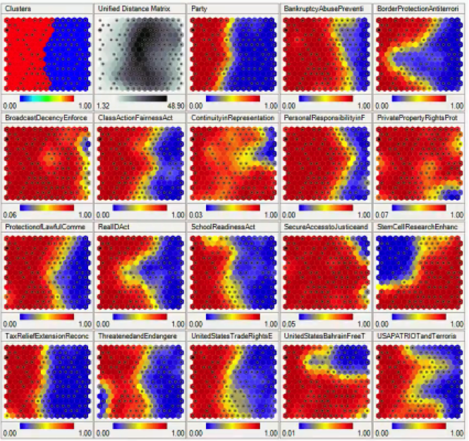
It’s now time to crank it up a notch and see what it takes to read a more advanced SOM then the ones we’ve been dealing with so far. Here we have an example of an SOM that carries within it multiple SOMs.
Maps like this one will not always show up in your SOM-related projects, but it’s nevertheless a useful skill to know what to make of them.
This SOM displays voting patterns inside the United States Congress, with each sub-SOM showing the patterns for a specific act or decision.
Without any supervision as usual, the SOM was able to monitor voting patterns among Congress members, and based on these patterns, it was able to divide the members into groups based on their partisan affiliations.
Let’s examine each SOM in that grid individually.
SOM 1×1: Clusters
There’s an interesting detail to take note of. Notice that the first SOM displaying the clusters actually differs from the “Party” SOM in the same row.
You would expect the clusters to be divided along partisan lines, but apparently, the SOM has detected some overlapping in the voting patterns of members from both parties.
The “Clusters” SOM is based on the sum of all the votes on all these different issues, and so it’s very likely to find members of the Democratic Party siding with the Republicans and vice versa.
SOM 1×2: Unified Distance Matrix
The Unified Distance Matrix, or the U-matrix, represents the distances between the points or nodes on the SOM. The dark parts in that matrix represent the parts of the map where the nodes are far away from each other, and the lighter parts represent less distances between the nodes.
You can even notice that the darkest parts are the same parts where the clusters are divided, which logically are the parts with the widest distances between the nodes.
SOM 1×4: Bankruptcy/Abuse Prevention
In this map, you can see that the border between the two sides is drawn a bit further to the right from where it appears in the “Clusters” SOM. That means that more people took the Republican side, including members who appear on the Democratic Party’s side in the “Clusters” map.
SOMs make it possible for you to visually detect these deviations without having to monitor all the data.
SOM 1×5: Border Protection/Anti-Terrorism
A lot of members from the Republican cluster appear to have taken the Democratic side which interestingly deviates at the middle more than anywhere else.
SOM 1×6: Broadcast Decency Enforcement
What you see in this map is one of the rare incidents of cross-party unity in the US Congress. Almost the entire Democratic bloc appears to have turned conservative on that particular issue.
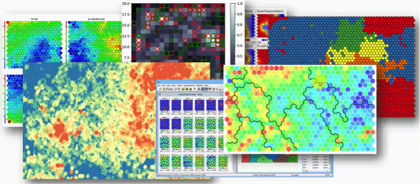
Now you probably get the idea of how to read an SOM of that kind. You will find that the simplicity of SOMs facilitates various forms of implementation. Observe this beautiful collage of confusing figures. These are all forms of SOMs.
With enough of an intuitive ability to read an SOM, which this section is aimed at, you will find yourself capable of reading most of these despite their countless different forms.
Additional Reading
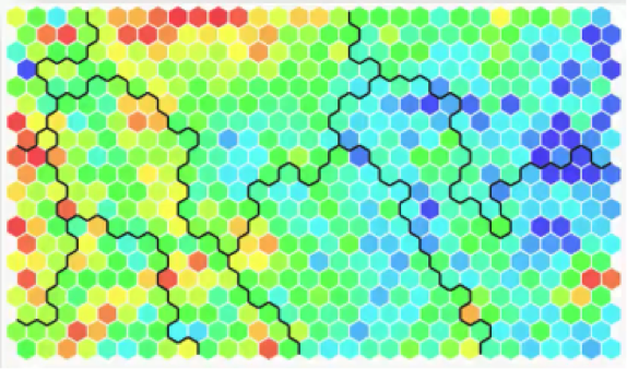
There is a particular SOM up there in the collage that you should check out and examine more closely. It’s this one below.
You will find it in an article from 2013 titled “SOM – Creating hexagonal heatmaps with D3.js” by Nadieh Bremer. The blogpost was posted on Visual Cinnamon.
As you can see from the name, the SOM was coded using D3.js. You will probably find it interesting to learn more about this amazingly useful JavaScript library.
Also, Nadieh Bremer, the author, made a great job of presenting the SOM in the blogpost. She shows how she came up with this visual representation, the hexagons, and displays the code for all of that. If you have any background in coding, you shouldn’t find difficulties at all in understanding the code.
You’ll find the full code if you visit this link.
If you’re interested in trying out D3.js, then while you’re on that website (bl.ocks.org) where the code is, check out the “Popular” section linked to over there at the top right corner.
You’ll find a goldmine of D3.js-based graphs and representations including SOMs. You’ll see how interactive D3.js can make things.
How to Boost Your Understanding of SOMs
The most important thing to walk away with from this tutorial, and from the section on SOMs as a whole, is that SOMs are by far the simplest type of neural network and form of visual data representation that we discussed.
You don’t need too much coding experience to be able to code an SOM using R, Python, JavaScript, Java, or pretty much any coding language out there.
It’s not exactly a complex job, especially given the fact that you’re not limited to any shapes, formats, or otherwise. You can use square, circles, hexagons, or whatever else you wish to use. The mathematics behind SOMs is also extremely uncomplicated.
All you need to do is find one programming language that you are absolutely comfortable with and challenge yourself at creating a few SOMs using different forms of implementation if possible.
You can search online for libraries that can give you the kick-start there.
The next two tutorials are extras. We’ll be having two more parts on K-means clustering. You don’t need to take these tutorials, but if you really want to get a tighter grasp on our original topic, you’ll absolutely find them helpful.