

K-Means Clustering (Refresher)
(For the PPT of this lecture Click Here)
For starters, K-means is a clustering algorithm as apparent from the title of this tutorial. As we discuss K-means, you’ll get to realize how this algorithm can introduce you to categories in your datasets that you wouldn’t have been able to discover otherwise.
In this tutorial you’ll get to learn the K-means process at an intuitive level, and we’ll go through an example of how it works. Let’s get to it.
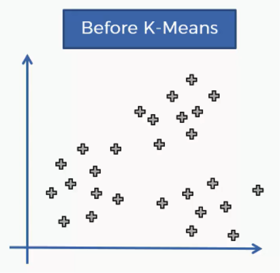
The K-means process begins with a scatter plot like the one you see in the chart below.
What this chart represents are two variables depicted on the X- and Y-axes, and the points represent our observations regarding these two variables.
The question is: How do we identify the categories using this data?
Should the observations be categorized by proximity, alignment or otherwise? How many categories are there?
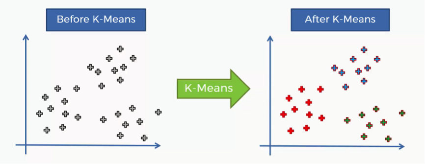
That’s where the K-means algorithm comes into play. It helps us identify the categories more easily as you can see in the image below.
In this case we have three clusters.
Bear in mind that our example shows a two-dimensional dataset, and so it is only for purposes of illustration since K-means can deal with multidimensional datasets.
How does the K-means method work step by step?
- Step One: Choose the number of clusters.
Before processing the dataset into categories, the number of clusters has to be agreed upon.
- Step Two: Randomly select K points to act as centroids.
If you have a scatter plot like the one we examined earlier, all you need to do is choose a random (x,y) point. It doesn’t necessarily have to be one of the observation plots from your dataset.
Literally, any x-y value would do.
The most important thing is that you need as many centroids as clusters.
- Step Three: Assign each data point to the centroid closest to it.
This is how you actually form K clusters. As the data points are assigned to their centroids, the clusters emerge around these centroids.
To avoid any confusion, we’ll use Euclidean distance in our tutorials.
- Step Four: Compute and place the new centroid of each cluster.
You’ll see how this step is implemented when we get to the example.
- Step Five: Reassign the data points to the centroid that is closest to them now.
If any reassignments actually occur, then you need to go back to step 4 and repeat until there are no more to be made. If there aren’t any, then that means that you’re done with the process and your model is ready.
This might be sounding a bit complex if it’s your first time to encounter K-means, but as we go through our visual example, you’ll see for yourself how simple the process can actually be.
Afterward, you’ll be able to refer to this 5-step manual whenever you’re dealing with K-means clustering.
A Two-Dimensional Example
In our example, we’ll be demonstrating each step separately. Let’s go.
- Step One: Choose the number of Clusters
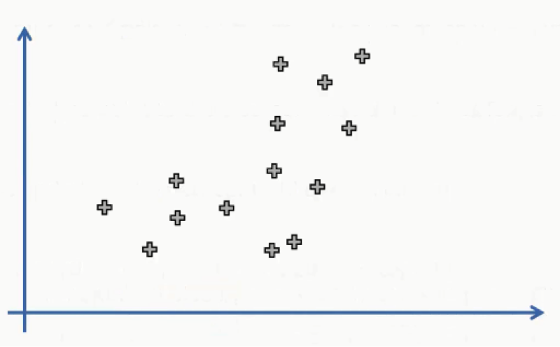
As we said earlier, you start off the K-means clustering process with a scatter plot chart like this one:
We have our observations plotted along the two-axes, each of which represents a variable.
You can see how tough it might be to categorize this dataset despite the fact that it’s merely a two-dimensional set. Imagine the difficulty of trying to do so with a multidimensional dataset.
If it’s a 5-dimensional set, for instance, we wouldn’t even be able to display it in a scatter plot to begin with.
We’ll resort to the K-means algorithm to do the job for us, but in this example, we’ll be manually performing the algorithm. Usually, the algorithm is enacted using programming tools like Python and R. For the sake of simplifying our example, we’ll agree on 2 as the number of our clusters. That means that K=2.
Further down in this section, we’ll learn how to find the optimal number of clusters.
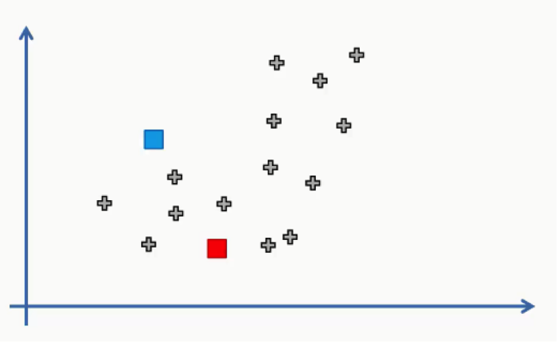
- Step Two: Randomly select K points to act as centroids.
In this step we can use one of the data points on the scatter plot or any other point.
In this case, we didn’t use any of the data points as centroids.
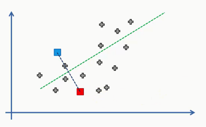
- Step Three: Assign each data point to the centroid closest to it.
Now all we need to do is see which of these centroids is closest to each of our data points.
Instead of doing that point by point, we’ll use a trick that you probably remember if you were awake during your high school geometry classes.
We’ll draw a straight line between the two centroids, then a perpendicular line right at the middle of this straight line.
That’s what we will end up with:
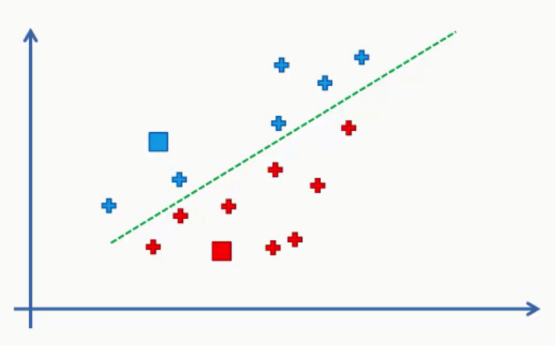
As we can see from the figure above, any data point falling above the green line is closer to the blue centroid, whereas any point beneath it is closer to the red one.
We then color our data points by the colors of their centroids.
Just to remind you, we are using Euclidean distances here. There are various other methods for measuring distance, and it’s your job as a data scientist to find the optimal method for each case.
The reason we’re using Euclidean distance here is that it is the most straightforward of all the other methods.
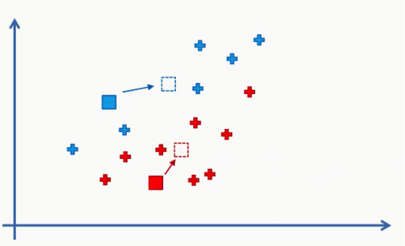
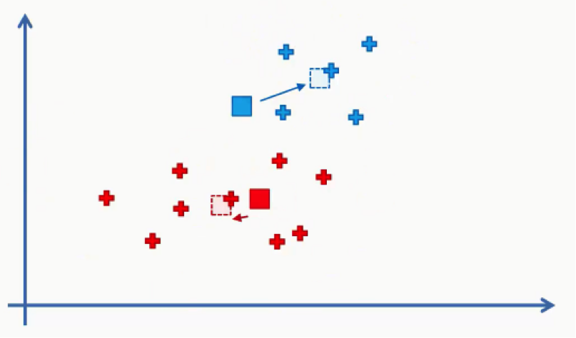
- Step Four: Compute and place the new centroid of each cluster.
Think of your centroids as weightless points with weighted data points gathered around them.
We need to find and plot the new centroids at the center of each cluster’s mass like you see in the figure below.
You can either intuitively find that center of gravity for each cluster using your own eyes, or calculate the average of the x-y coordinates for all the points inside the cluster.
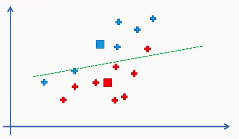
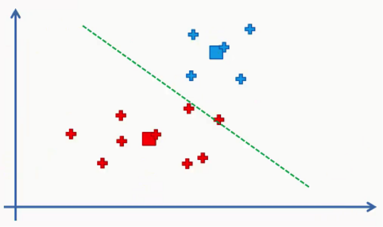
- Step Five: Reassign the data points to the centroid that is closest to them now.
What we’ll do here is draw the same line that we drew in step three between our two new centroids.
As you can see, one of the red data points ended up in the blue cluster, and two blue points fell into the red cluster. These points will be recolored to fit their new clusters. In this case, we’ll have to go back to step 4.
Then we will repeat step 5 by reassigning each data point to its new centroid.
Again, we will end up with one red data point shifting to the blue cluster. This will take us back to step 4 and we’ll keep repeating until there are no more reassignments to be made. After a couple more repetitions of these steps, we’ll find ourselves with the figure below.