

How do Self-Organizing Maps Work?
Now it’s time for our first tutorial on self-organizing maps (SOMs). You’ll find it to be surprisingly simple, although not without its intricacies. Clear your mind and let’s get to it.
We’ve already covered the three machine learning methods that fall into the category of “supervised deep learning.” These are:
- Artificial Neural Networks
- Convolutional Neural Networks
- Recurrent Neural Networks
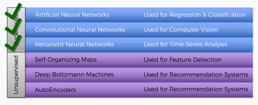
SOMs will be our first step into the unsupervised category.
Self-organizing maps go back to the 1980s, and the credit for introducing them goes to Teuvo Kohonen, the man you see in the picture below.
Self-organizing maps are even often referred to as Kohonen maps.

What is the core purpose of SOMs?
The short answer would be reducing dimensionality. The example below of a SOM comes from a paper discussing an amazingly interesting application of self-organizing maps in astronomy.
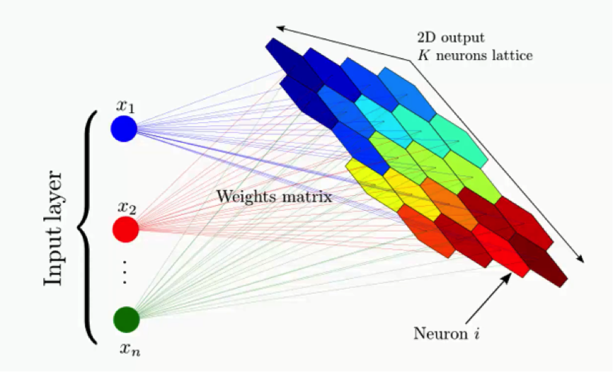
The example shows a complex data set consisting of a massive amount of columns and dimensions and demonstrates how that data set’s dimensionality can be reduced.
So, instead of having to deal with hundreds of rows and columns (because who would want that!), the data is processed into a simplified map; that’s what we call a self-organizing map.
The map provides you with a two-dimensional representation of the exact same data set; one that is easier to read.
What exactly is the outcome to be gained from this process?
What you see below is an actual SOM. This map represents the levels of economic wellbeing across a wide range of countries.
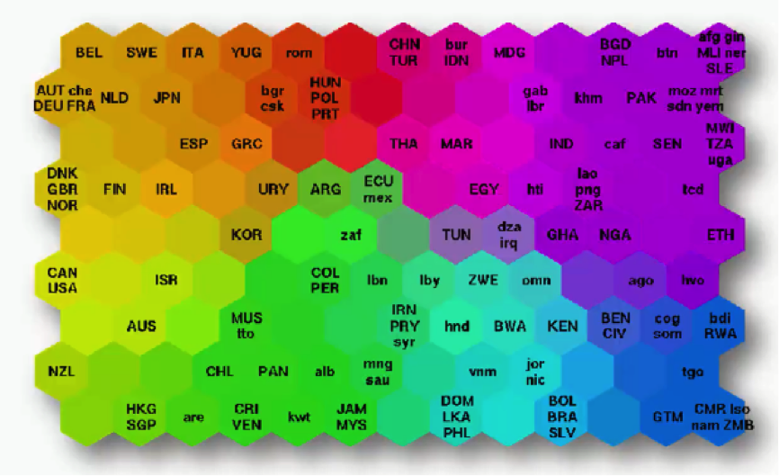
As you can see, the countries are lined up in a cluster, and their order inside that cluster is based on various indicators (e.g. health conditions, quality of education, average income per capita, etc.).
You can imagine this data set of 200+ countries to have started off with 39 different columns. It’s tough to imagine such a bulk of data, isn’t it?
That’s exactly why we use SOMs.
Instead of presenting you with each indicator separately, the SOM lines up the countries inside this cluster to make up a spectrum of wellbeing.
You can see the countries on the left side being the ones with the best economic statuses, although they vary in colors based on their positions within the category of high-income countries.
Then as you move to the right, you find the countries getting poorer until you reach the far right which contains the countries with the direst levels of poverty.
There’s an important difference between SOMs as an unsupervised deep learning tool and the supervised deep learning methods like convolutional neural networks that you need to understand.
While in supervised methods the network is given a labeled data set that helps it classify the data into these categories, SOMs receive unlabeled data. The SOM is given the data set and it has to learn how to classify its components on its own.
In this example, it would look at, say, Norway, Sweden, and Belgium, and left to its own devices, it learns that these countries belong together within the same area on the spectrum. Besides giving us an easy way to read this data, SOMs have a wider range of uses.
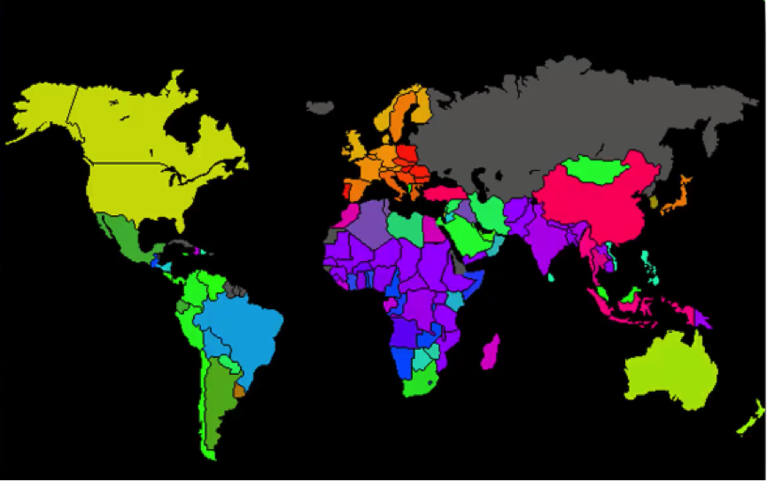
For instance, you probably saw a map similar to the one below where countries are colored based on their human development scores, crime levels, military spending, etc. Such maps can be colored using a SOM, since we can take the colors that the SOM chose for each group and apply it to our world map.
Here’s how the process goes:
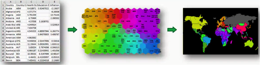
In this case, we got the data set from the World Bank containing all 39 indicators of human development, processed them into a SOM, and then applied that to a world map. As simple as that!
If you want to study this process at a more detailed level, we would recommend a paper titled “The Self-Organizing Map” that was authored by Tuevo Koheonen himself back in 1990.
Now, off to the next tutorial!