

Creating works of art using Tableau custom maps …and the importance of polygons
Why would we be dedicating an article to understanding an elementary geometry concept such as the polygon? And why are we combining this with maps in Tableau – aren’t these distinctly separate chart types in Tableau?
Hands up, who knows the relation between spatial shapefiles and polygons?
No hands? Good, then you need to keep reading….
Many will be surprised by the power that can be unlocked by using the polygon shape type in Tableau, especially working with maps in Tableau.
This article will refresh your geometry knowledge, guide you through properly working with polygons in Tableau and explain why this concept is super important when working with maps in Tableau.
As always, in true SuperDataScience spirit, we will be Making the complex simple by explaining the concepts using some real-life examples.
Since you have made the effort to keep reading this far, I will let you in on a little secret as well. Not only will we also share some custom charts that you can create using polygons, but you will also show you how to create maps that you never thought is possible in Tableau. Some more on that later.
But first, let us revisit what we know about polygons.
Is it more a case of Polygone?
Like me, school might have been many moons ago, and you might have long forgotten some of the basic geometry taught in elementary school. Or perhaps at worst you just need a gentle refresher, either way, we will convert your polygone to polygon!
The Wikipedia definition states that a polygon is a plane figure that is bounded by a finite chain of straight line segments closing in a loop to form a closed polygonal chain or circuit.
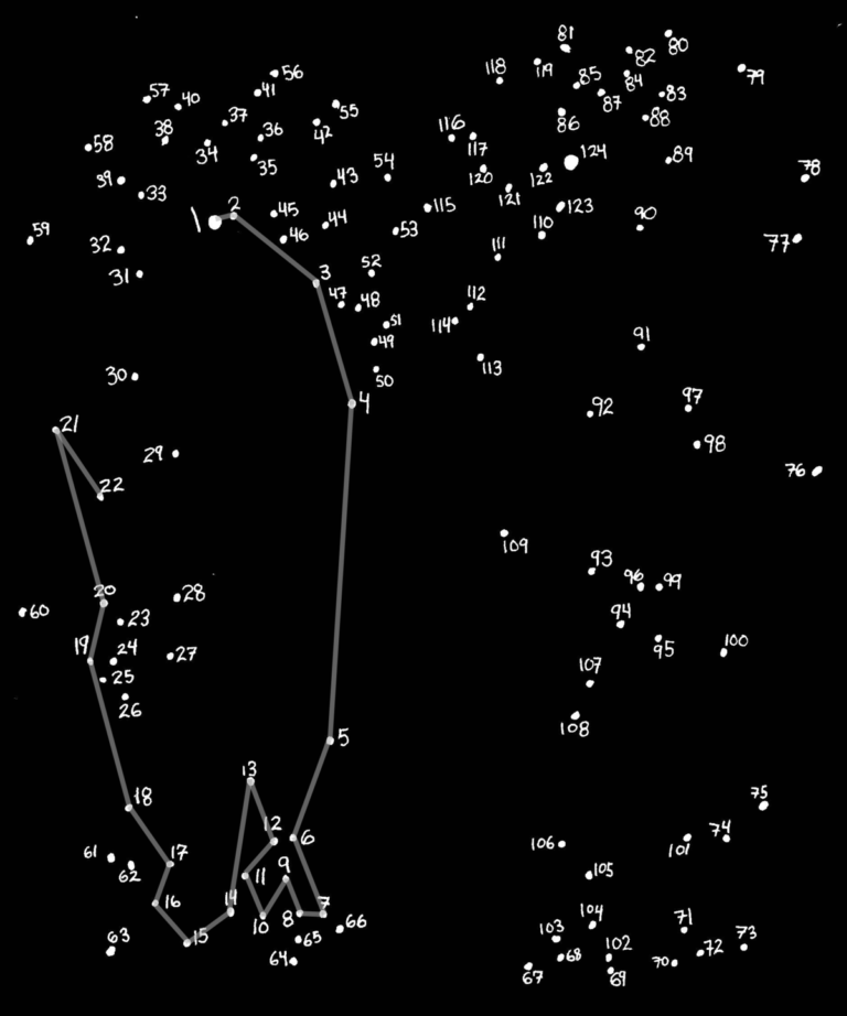
These pictures kept us busy for hours and the concept is actually quite basic.
You start off at a given point (numbered 1), and following the numbered dots in sequence, connect each of the dots by drawing a line with a pen. This reveals a hidden object (or shape) once the last dot has been connected.
Enough playing around …what has a children’s game got to do with Tableau?
When looking at Tableau, and how it works with polygons it is in fact very similar to the Connect the dots pictures. We can use this knowledge to draw polygons in Tableau.
We need to define the starting point as well as well as the next point to connect to.
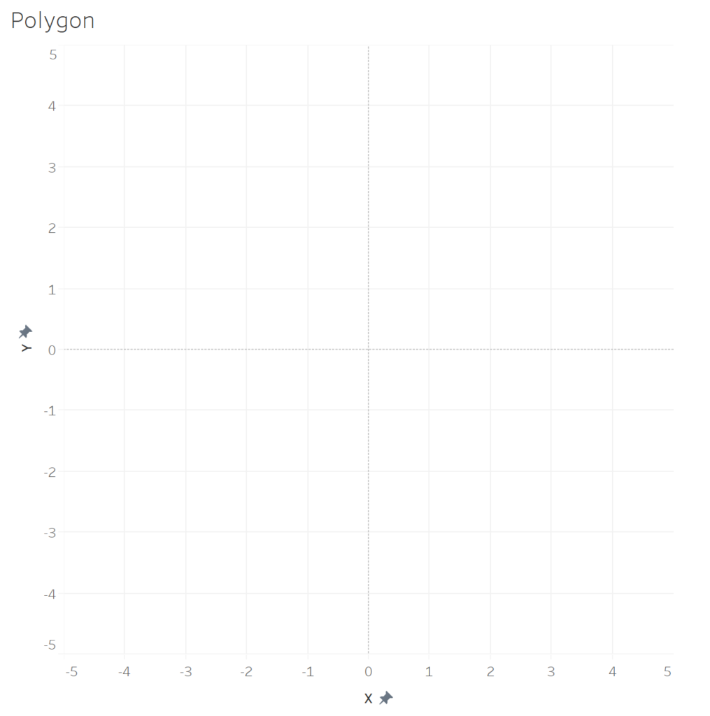
Before we continue, let us just remind ourselves that Tableau will require actual coordinates (x,y positions) on the graph in order to plot the points correctly. You can think of the following X and Y axis to start off with:
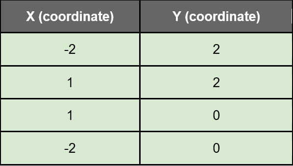
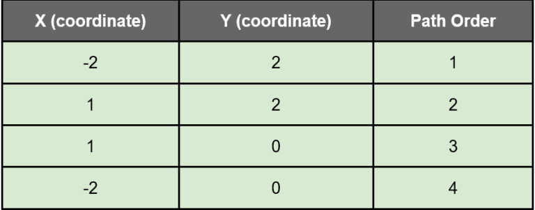
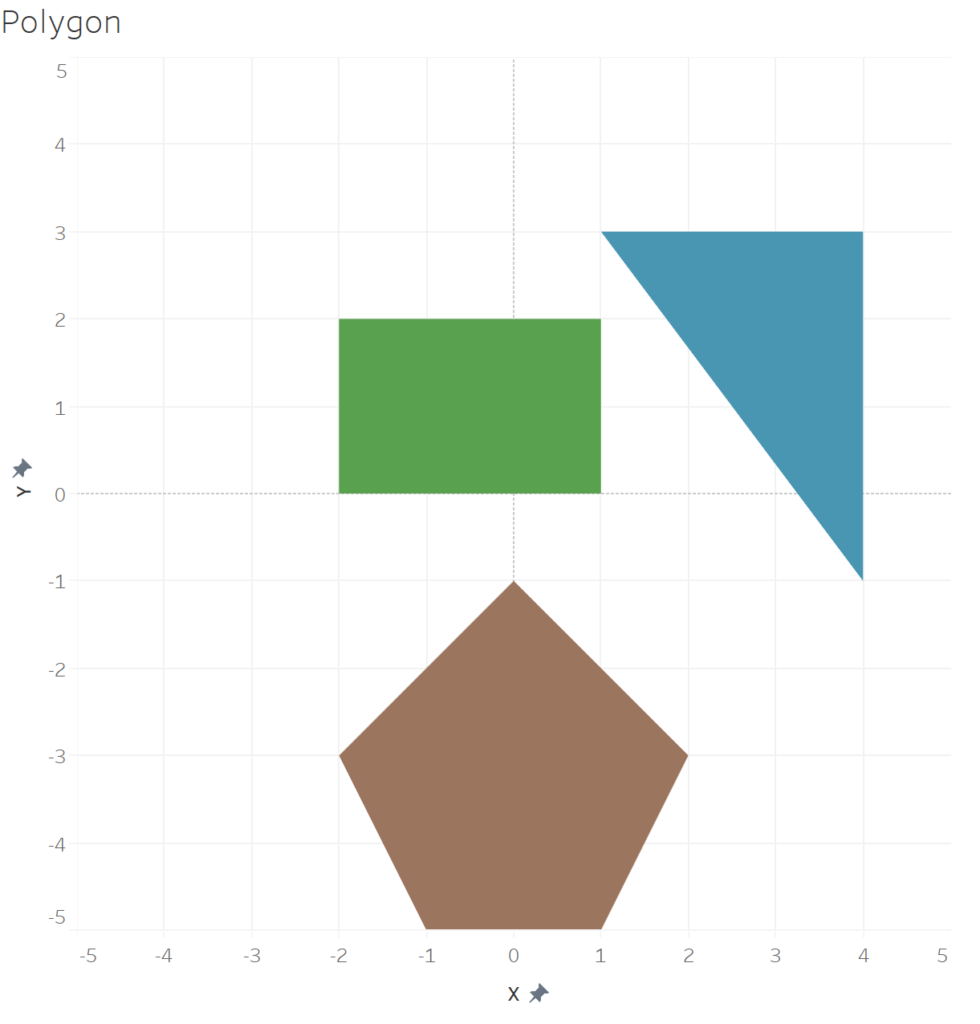
We need to define the actual placement of the different points. So let us take drawing a rectangle, we will assign it the following four points:
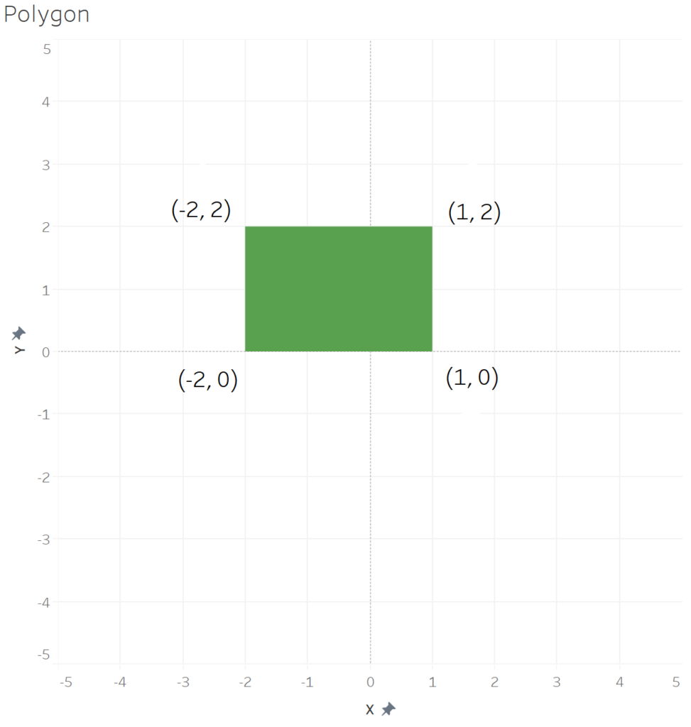
The output will look like this:
But Tableau is not able to draw this without us specifying the sequence in which it needs to draw the lines (and connect the coordinates specified), and therefore we need to add a Path Order field to the data which indicates the order in which they will be connected:
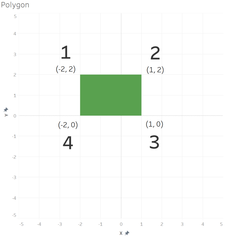
Here is a diagrammatic representation of the output:
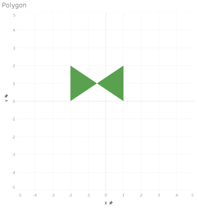
Not adding the path order, will output a distorted image, as Tableau then need to guess the sequence. Here is the example of the above polygon without the Path Order:
We can add more shapes to the diagram, each with its own set of coordinates and restarting the path order for every new shape:
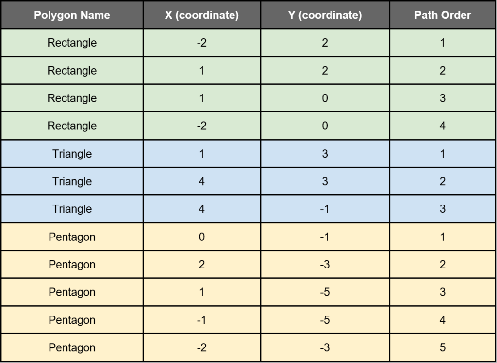
This output will look as follows:
Kicking it up a notch
Up to now, we had some basic examples to illustrate the foundation of how polygons are created. However, the same method forms the base for some mind-blowing custom charts in Tableau.
Below we have two examples of such charts – the Radial Gauge Chart and the Sunburst Chart. Both guaranteed to take your visualisation to the next level.
If you are keen to know how to create them, see the links to the YouTube tutorial on the SuperDataScience channel:
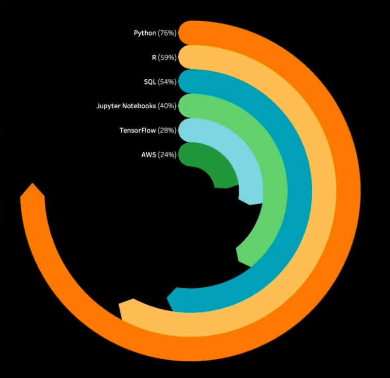
Radial Gauge Chart
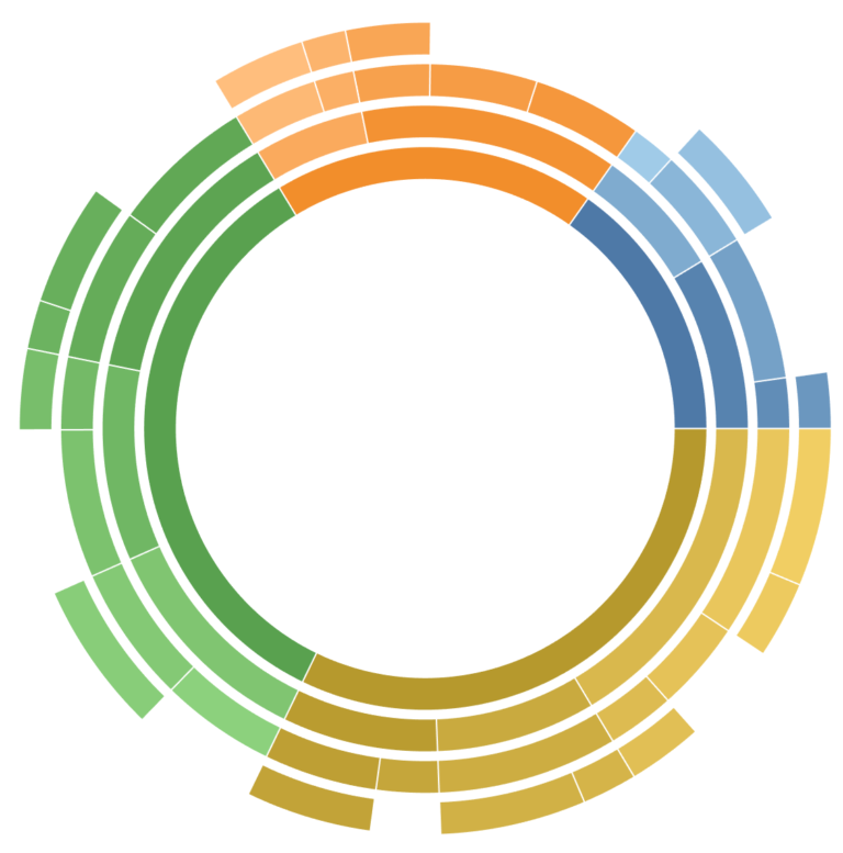
Sunburst Chart
Life’s too short not to use shortcuts…
How do we make our lives easier in creating polygons?
We do not need to, the guys at Interworks has already developed an online tool as part of their suite of Power Tools for Tableau. The tool is called the Drawing Tool for Tableau, and assists with generating the data required for drawing the polygon for maps. These spatial polygon shapes are also referred to as shapefiles, but more about that a bit later.
In addition to drawing shapes on the map, the tool also provides the functionality for you to upload images and use these to create a specific shape polygon. The tool generates the required data which you can use in combination with existing data in Tableau.
Here is a short intro created by the Interworks team, giving you a running start on using the tool:
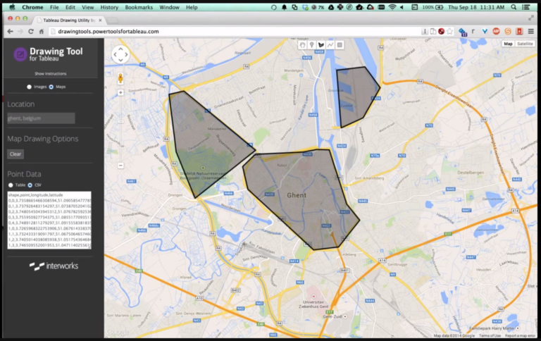
Trust me, it is a super helpful and handy tool. Head on over to http://drawingtool.powertoolsfortableau.com/ to start using it!
You can thank me later…
Finally, we get to the star of the article: Maps
All new Tableauers are always excited to start working with maps, due to the explicit and communicative manner in which the data is presented. (The audience normally love them too!)
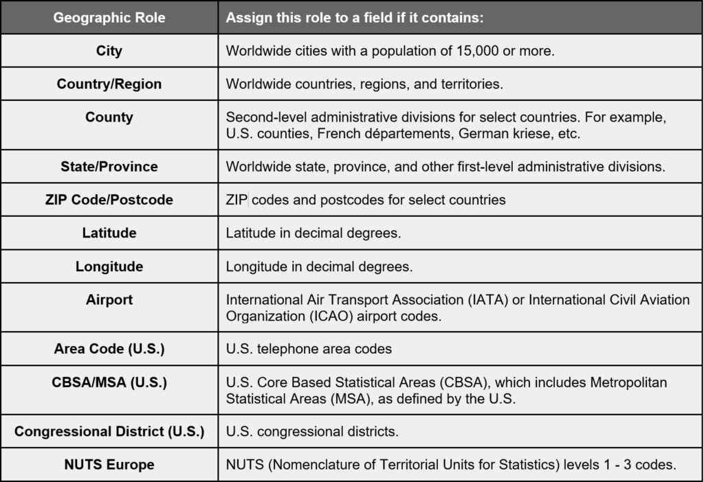
There are already a number of geographic roles built into Tableau to which your data can be mapped. They even catered for names in languages other than English, such as French, German, Spanish, Brazilian-Portuguese, Japanese, Korean, and Chinese.
Below is a quick overview of the available geographic roles in Tableau. For the full detail, refer to http://onlinehelp.tableau.com/current/pro/desktop/en-us/maps_geographicroles.html.
Using these predefined geographic roles, we are able to create a couple of different types of map charts, each with its own purpose:
Proportional symbol maps
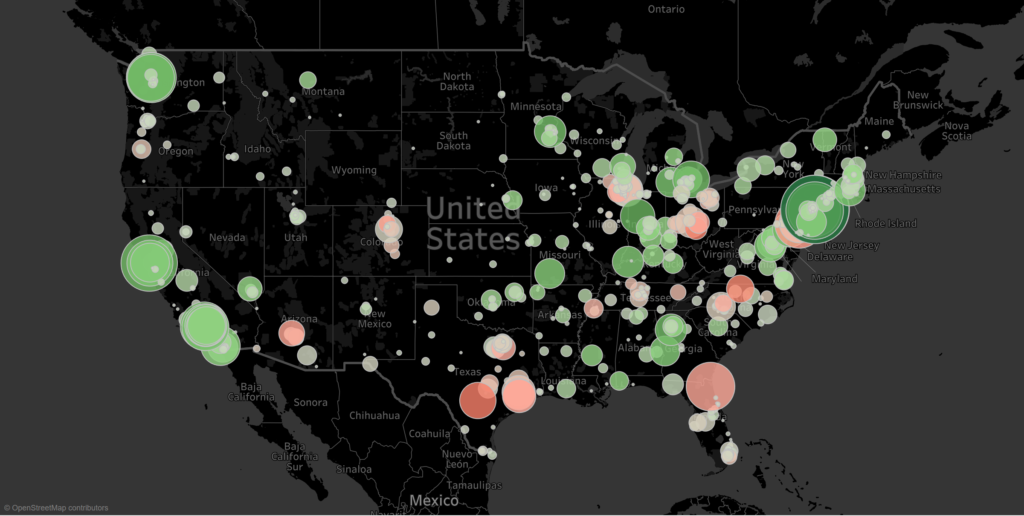
Using different mark types (such as circles, blocks etc) combined with size (and colour) we can highlight dimensions based on specific measure values in proportion to one another.
Filled Maps
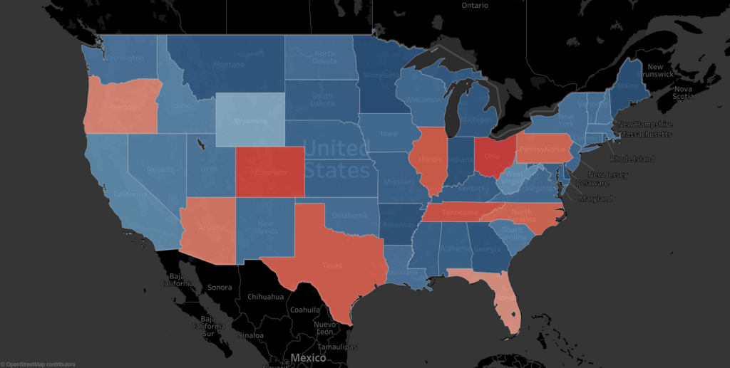
Probably the most commonly used map chart. It uses colours in combination with shapefiles to portray and compare measures across dimensions.
Point distribution map
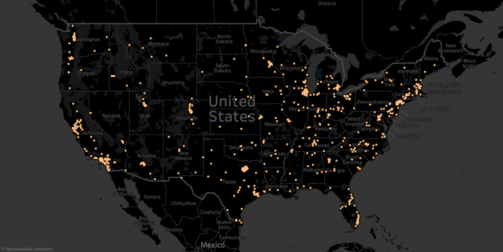
Very useful to depict observations on a map with the purpose of spotting clusters of observations.
Origin/Destination Maps
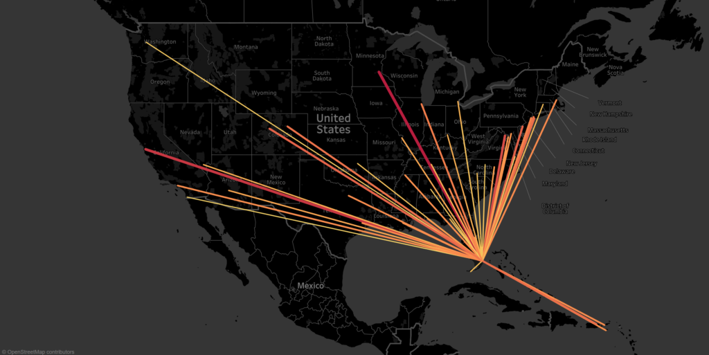
Using start and end points we can draw lines connecting start and end of a journey or route.
Flow maps
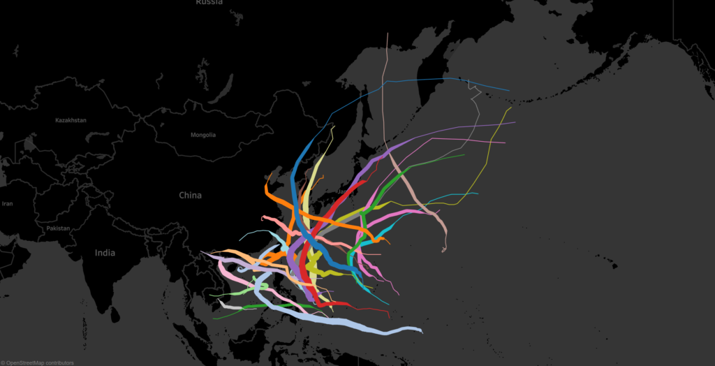
Similar to Origin/Destination maps, but it is made up of multiple start and end points per item and is normally used to depict the movement and strength of (for instance) storms.
Now that we have a base understanding of polygons and different map types in Tableau, let’s combine the two.
Enter spatial files.
These are also referred to as shapefiles and contain all information required for drawing the shapes (polygons) on a map.
Shapefiles can come in different formats and types, and Tableau caters for the following:
- MapInfo tables (.tab, .dat, .map, and .id or .mid or .mif files)
- KML files: (.kmlfile)
- GeoJSON files (.geojson)
- ESRI shapefiles (.shp, .shx, and .dbf files)
We will focus on the ESRI shapefiles. Contained within the package should be the following at a minimum:
- .shp — Shape format; the feature geometry itself
- .shx — Shape index format; a positional index of the feature geometry to allow seeking forwards and backwards quickly.
- .dbf — Attribute format; columnar attributes for each shape, (dBase IV format)
It is also possible for other elements to be included. For more info on shapefiles, you can refer to the following Wikipedia article: https://en.wikipedia.org/wiki/Shapefile
Now let’s start using them…
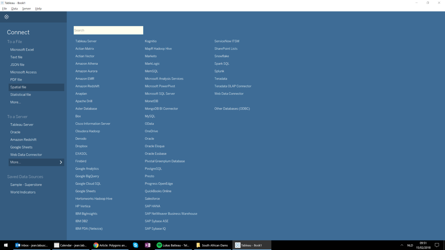
Working with shapefiles in Tableau cannot be easier, as Tableau has built-in functionality to read and map these files by using the Spatial Files connection available as a data source:
You may now wonder..
Why is it that we need to work with external shapefiles if most of the countries, states, provinces etc. are already defined by default in Tableau?
Unfortunately, that is sometimes just not enough! Let’s look a bit closer why that is.
Let’s say you need to present natural resources (such as dams) on a Tableau map. These are not defined in Tableau, and this is where shapefiles come in handy.
There are a lot of shapefile packages available on the internet relating to a vast amount of different topics. Some are paid, but you will also come across a lot of free resources. And hey, why reinvent the wheel if it is not necessary!
I dug a bit deeper into the dams example (no pun intended) and was looking specifically for dams in South Africa with focus on the Cape Town region. After a quick search on the internet, I was able to obtain an unofficial copy of all dams and rivers in South Africa from the South African Department of Water and Sanitation (http://www.dwaf.gov.za/iwqs/gis_data/river/rivs500k.aspx).
It might be an unofficial copy, but works just fine for the purposes of this article, and on top of that it is already in the ESRI shapefile format.
Once we have connected to it in Tableau using the Spatial file connection, we can filter for specific dams that we interested in, and use the Geometry measure to draw the polygons shape of the dams on the map, and of course, add the name onto label:
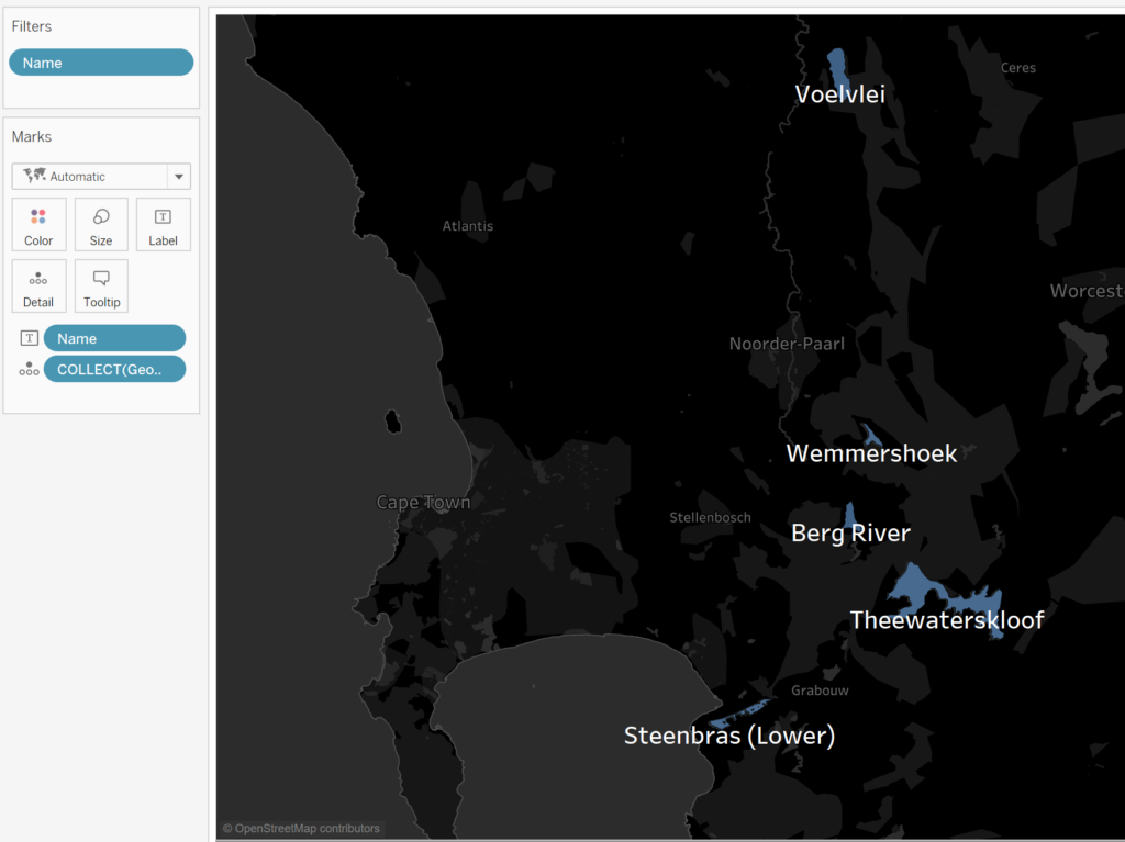
You will see that the data supplied in the shapefile draws a perfect polygon representation of the actual contours of the dam edges:
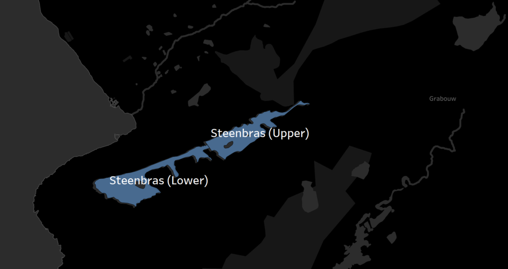
For the purposes of the article, we will be focusing on the 6 major dams in the Cape Town region: Wemmershoek, Steenbras (Upper), Steenbras (Lower), Voelvlei, Theewaterskloof and Berg River.
Now that these are drawn, we might also want to include additional information, such as Dam Capacity supplied in the table below. We can simply connect to the data and perform a blend to include it in the visualisation.
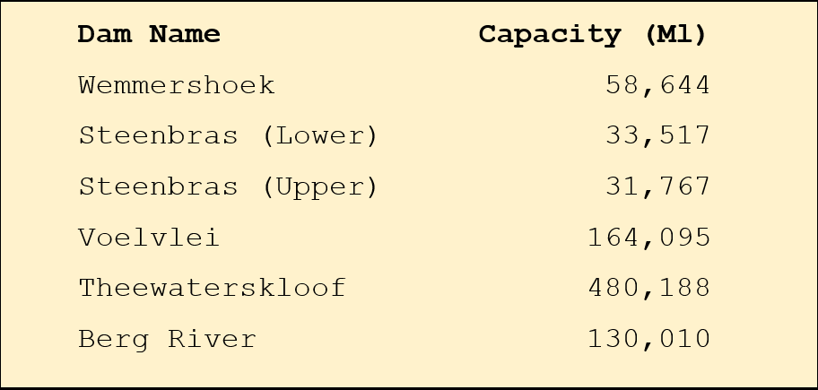
With a successful relationship set up for the blend between the Dam Names in the two data sources, we are able to include the capacity onto the visualisation in the label as well as use it for the colour:
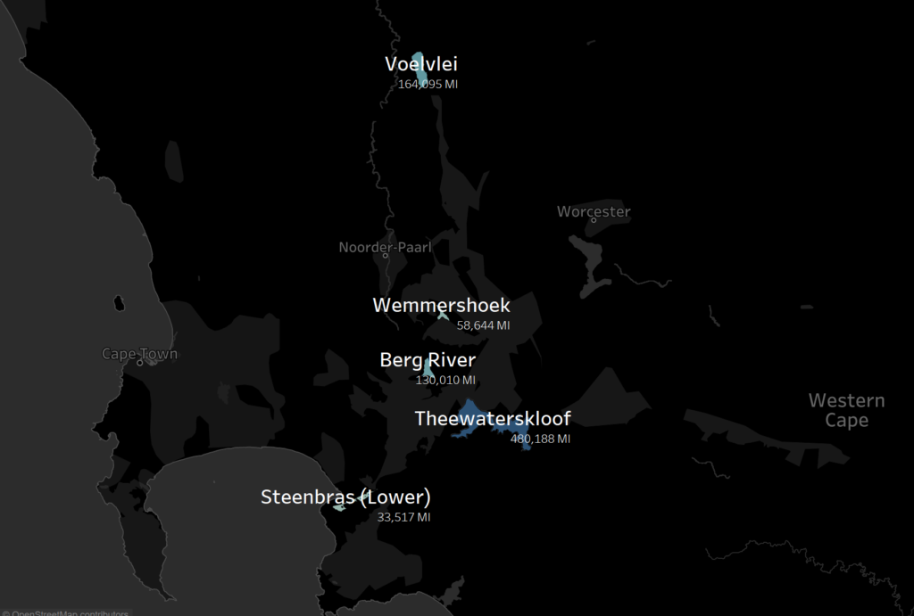
The possibilities from here on end are endless, we can basically add any data related to the dams onto the visualisation.
But why are the maps black?
No need to adjust your screen!
You might have noticed that the map output above is not using the standard colouring of the maps in Tableau. This is just my personal preference, and I have chosen the Dark Style for my map layer, as I believe it enhances the dam contours and have it stand out.
We have three options to choose from for the map layers (menu option Map > Map Layers…). The three options that are available:
It is obviously up to you to use the best style for your purposes. It is great that we have these three map layers to choose, but I am of the opinion that we can improve on it even more.
Mapbox
Map what? Mapbox.
This might as well be one of the best-kept secrets, and I really excited to share this with you. Let us start off with what Mapbox is and how it relates to Tableau.
Mapbox defines themselves as the location data platform for mobile and web applications that provide building blocks to add location features like maps, search, and navigation into any experience you create. (https://www.mapbox.com/about/).
In short: They basically help you to make your maps look pretty!
Mapbox does not have an affiliation with Tableau, but Tableau does allow for seamless integration to maps on Mapbox. Mapbox is a paid product (see pricing), but also provides a trimmed down version of the features to try out and for you to get comfortable before you start forking anything out. All that is required is a quick registration, and you can then get started creating your own maps, or even just use one of the many free maps already available.
Once your account has been created, you will receive an access token which is required when connecting to Mapbox from within Tableau. In the Studio section of Mapbox profile, you are able to create your own styles, or use some of the artist’s work and customise it to your liking.
You can consult Mapbox resources section for assistance on how to work with Mapbox: https://www.mapbox.com/help/
We will be using some of the standard map layers to showcase how it takes your map from “oh nice, another map” to “oh my gosh, that looks spectacular!”
From basic to spectacular
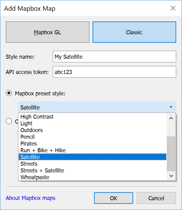
It couldn’t be easier to change your current map to a custom layer (menu Map > Background Maps > Map Services). On the dialogue box that opens, you need to select Add > Mapbox Maps.
Under the classic option, you define a new style name, input your access token and then you can select one of the preset styles (or one of your custom styles):
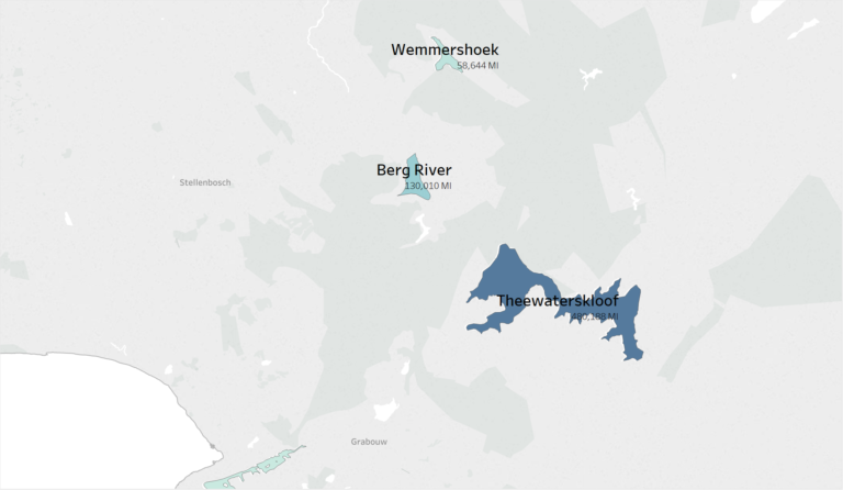
Let us take the Cape Town Dam example. By simply applying the Satellite style, it transforms the map into a more natural feel – quite fitting with the dam theme:
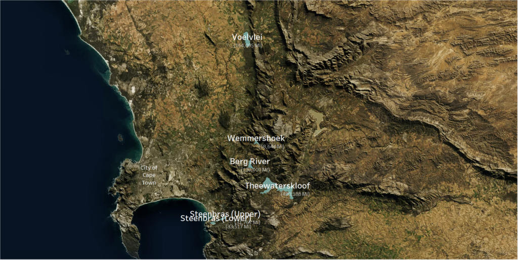
Mapbox Satellite Style
For a more simple looking, but still quite specmapular (see what I did there), we can also apply the Pencil style.The focus is immediately shifted back to the data being presented
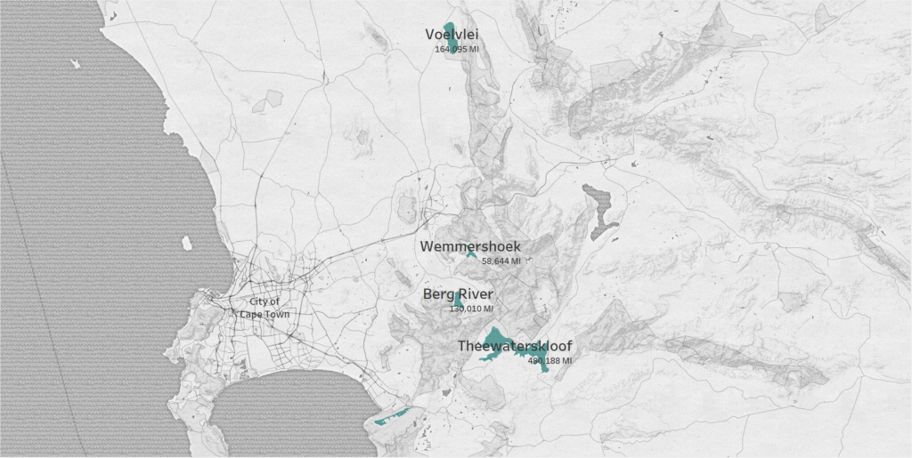
These are just two of my favourites, and what a difference does it not make!
Imagine the possibilities!
We have given you a good running start, but if you want to know even more about working with Mapbox in Tableau, you can find some additional resources here: https://onlinehelp.tableau.com/current/pro/desktop/en-us/maps_mapsources_mapbox.html
Phew! Now that has been quite a journey.
Let’s do a quick recap… We now know what polygons are and that they form the basis of shapefiles.
We also revisited the built-in Tableau shapefiles defined by different geographical roles, but we have also seen that it is possible to create our own shapefiles or use custom shapefiles in the dams example.
The cherry on the cake (so to speak) was to take our maps from the Tableau standard map layers and use Mapbox to magically transform our maps to beautiful works of art!
I trust you are now equipped and inspired, all that is left is to…
Go make some art!